We began exploring and researching into the existing Frontier material through there online presence such as there website seeing their use of Pantone's and tone used in there typography.

We really liked the use of the 'old timey' map with use of opacity to make the pantone colour bleed through the map.
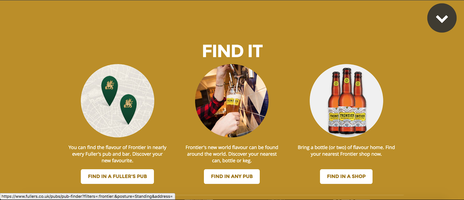
We liked the use of the circle tabs and wanted to explare the idea of supporting imagery with a tab.

The brewer notes explaining the flavour were heavily shown on the website however the YCN brief pack suggested that we tried to stay away from the aspect.

Inbuild fidget features allowing for the use of social media to update onto the website adding constant content to the website.
No comments:
Post a Comment