Thursday, 24 December 2015

OUGD404 - Study task 6 - What is a book?

The dictoniary definition of a book is that of written or printed work consisting of pages glued or sewn together along one side and bound in covers. There are many ways in which to bind books by hand such as, contrast chain stitch, stab stitch binding, case binding, spiral binding, comb binding and hardcover. Each type of binding is suited to different type of publication styles. 

This book looks to be made from an outer layer of yellow card, with pages that look to be high quality cartridge paper are they are very thick compared to the card. The book has been bound with the stab stick method that has been adapted to create a nice patterned and secure the pages a lot more than a simple stab stick would. With the black cover and good quality pages this book looks to be a sketch book or possibly a note book. The design is simple but effective for its intended purpose. 


This book looks to be made from a hard front, back and spin cover that has been covered with a piece of fabric that has a dragon screen printed onto it, this method creates a hard outer shell that protects the pages inside. The book has a nice red covering on the inside of the front and back that matches the dragon on the front so it looks consistent. The pages inside are blank so the intended purpose of the book is as a diary or note book that is made to last a long time.

This book is made in a concertina style with a hard front and back cover. This book intended purpose is to show off the artists work. The simple design shows off the back and white drawings off well, with the simple grey front and back, if it would of been any other colour the attention would of been taken away from the most important aspect of he book. The concertina style works really well with the content of the book as the pages flow along with the drawings. 

Wednesday, 23 December 2015

OUGD404 - Study task 5 - Canons

Canons - principles and rules of a page layout design use to measure and describe the proportions, margins and print area of a page.

Balance - Visual balance comes from arranging elements on the page so that no one section is heavier than the other. Or, in other instances, a designer may intentionally throw elements out of balance to create tension or a certain mood.

Proximity / Unity - In design, proximity or closeness creates a bond between elements on a page. How close together or far apart elements are placed suggests a relationship (or lack of) between what are otherwise disparate parts. Unity is also achieved by using a third element to connect distant parts. 

Alignment -  brings order to chaos. How you align type and graphics on a page and in relation to each other can make your layout easier or more difficult to read, foster familiarity, and/or bring excitement to a stale design.

Repetition / Consistency - Repeating design elements and consistent use of type and graphics styles within a document shows a reader where to go and helps them navigate your designs and layouts safely. Ensure that your document utilises the principles of repetition, consistency, and unity in page design.


Canons are important to layout designs, as they are used to measure and describe proportions of pages, margins and print areas. Popular canons that designers use are Van de Graaf's, Tschichold's Golden Canon and Tschichold's Octavo.


Tuesday, 1 December 2015

Signage typeface Research

An important factor when design a sign that has text on is you have to consider the legibility of the type from a distance, close up and at a hight. The type must be legible to everyone and also be readable at any angle so people can navigate efficiently without having to stop and try and read the type. Keeping this in mind to make my sign design as successful as possibly i have to make sure the typeface used is appropriate, which has lead me to research which typeface is the most legible and which is the most commonly used typeface for signage.

 From looking at numerous web articles about typefaces and their legibility i found that san serif fonts where the most legible for short and large piece/lines of text and serif fonts are the most rebate fonts for bulk text such as newspaper articles and information. With this information i know that i need to be choosing a font that is sans serif if i want my design to be successful and legible.

When researching the most commonly used typeface for signage a came across a list of different typefaces that are used for different signs around the world. I thought this would be a good starting point to look at them and see which i thought was the most successful and possibly the most appropriate for my way finder design.


British railway typeface


British road signs (until 1965)


Italian railway signs


Montreal metro 


NewYork subway


Swiss road signs

All the typefaces above are sans serif in style and have already been used for signage so they are proven to be legible enough for their intended use. Rail Alphabet and Gill sans are the boldest typefaces out of them all with their dark thick strokes, then its helvetica and frutiger with slightly thinner strokes and then the other typefaces that have more of a delicate stroke. 

Out of these typefaces i think that Frutiger or Helvetica would be the most appropriate was their strokes are not overly bold but not took thin that it limits the legibility when seen at a distance.


Wednesday, 25 November 2015

study task 1 looking at way finders

While walking round leeds for way finders my first port of call were the shopping centres as they are the most likely to be signposted and also have maps, and also the city centre itself as the centre has many different streets to navigate that can quickly get confusing. Below are a few select examples of the way finder i found in leeds...

The light
The way finders in the light were every inconsistent in style as they considered of 3 different typefaces that were difficult to read, especially from afar. The colour scheme of the signs and type is constant but doesn't match the style of shops that the centre has to offer. The shops in the centre are up market bars, restaurant and also has a cinema, which isn't reflected well in the style of waypfinders as the over all feel is immature and unprofessional, the opposite to who the centre is aimed at. The map was basic and had minimal detail so was efficient enough to navigate but lacked symbols and colour coding, which would make the map even easier to navigate. To improve this signs a simple change of limiting the use of different fonts from 3 to 1/2 and changing the colour scheme from pink and purple to possibly black and a dark blue. 

Leeds city centre
The way finders around leeds city centre consistent of maps, a pictogram key and also each map had a red bar across it tell you what street you were on. the red bar letting you what street you were on was very helpful for when you were following the map it made is easier to direct around the city as it made the street name that you were possibly looking for more visible. The map was easy to read and as it had colour code areas, street names and also listed shops. The most useful part of this way finder was across the top it has directions telling you were near by thing were and in which direction, the direction was shown by an arrow. This way finder was successful as in consisted of all the important information that you would need if you were lost or looking for a certain shop or street. To improve this way finder i would move the red bar with the street name to the top so it was the more dominate thing on the sign and possibly increase the type point a little to make it clear to read for everyone. 

Trinity Leeds
The way finders through out trinity leeds consisted of maps that were colour coded and included pictograms to help you never gate your way efficiently using the map, while walking round the shopping centre over head signs directed you to useful places such as lifts, exits and toilet facilities using pictograms, text and also arrows. To support the maps and the over head signs near every elevator and lift to the next floor were signs telling you briefly what was on each floor. The design of these way finders were consistent as the same typeface was used on all signage, the colour coding was consistent from the maps to the signs which made t easier to navigate, and the pictograms were also consistent in style and were simple enough for everyone to understand. To back up and also compliment the shopping centres signage and maps a personal map was available so that it made finding your way even more efficient as there was no need to stop and look at maps and sins you had your own leaflet map to navigate yourself around.       

Debemhams
The way finders in debemhams consistent of small over head signs through out the store directing you to the different departments and also facilities, and also large over head signs near the escalators telling you what was on each floor. These were accompanied by discrete signs on the underside of the escalators(above head) telling you what department you were going down to. Through out these way finders was the design was very consistent using the same colours, black as the background and white for text, creating a high contrast that gave the signs a very sophisticated look and feel to them, and also using the same style of arrow symbols and mix of a bold typeface for the levels and a regular typeface of the text. The overall feel of the way finders were sophisticated and also simplistic so fit well with the feel of the department store and wear easy to read, to improve the way finders usability i would make more lower signs for people with bad eye sight to also easily be able to navigate. 


Primark
The way finders in primary were very modern as they were mainly digital, in the images below it shows two of the different style of way finders shown on the same screen, there was a store map showing you in words and symbols were each part was on each floor and the other was a list of which department was on each floor along side images of people wear the stores clothes as promotion. To work along side this digital way finder there was a large scaled up floor list on the side of the lift to the left of this screen. These way finders are very modern and contemporary, but were inappropriate for finding your way as there was only one screen and the sides moves very fast which meant that if you haven't got all the information you wanted you need to wait for it come back around again, meaning standing in the way of other customers. There was only one of these screens through out the store, and there was no over head signs. To make make the digital way finders more successful more when need to be added to throughout the store and possibly make them interactive so you could browse at your own leisure, and not the fast pace the sides are set to.  

From looking at these way finders and the different types of ways to present way finders i found that the more successful ones had a variation of styles of signs such as over head signs, maps, and leaflets but still keep the design consistent through out all these methods of directing. Keeping the design basic was also what made a way finder successful, limited typefaces and colour help to simplify the design and allow the maps, directions and pictograms do the directing. 

Out of these example of way finders The lights way finders are the signs that need re design the most as they dont reflect its surroundings and lacks consistency.


Sunday, 15 November 2015

Studio Brief 2 Evaluation

In my final analysis of the hesitant typeface i conclude that i have effectively expressed my given adjective of hesitant to a high standard in which other designers and people could easily perceive from my final design. My typeface is constructed of  letter forms that have varied stroke widths, the lower parts of the strokes are thicker and the strokes get thinner the further up the letter. This create a contrast, and also suggests that the lower part of the letter is reluctant to move and is shy, unlike the higher parts of the stroke that are trying to pull away. The original Baskerville typeface also had varied stroke withs but it was very discrete, by emphasising this i transformed the typeface to relate to my given adjective.
If i was t develop the typeface further i would definitely create an italic version as Italics could be consider hesitant as they are usually smaller, and lighter than normal letter styles, this would emphasis the style of shy and hesitant more.
When evaluating the letter forms individually it was obvious that some expressed the style of hesitant more than others such as ‘q’ the slight tilt to the left that was achieved through the stroke width change made the letter look more hesitant than the rest as it appeared to be leaning. The varying stroke width were very obvious in  this letter form compared to those of ‘w’ and ‘y’. I also feel that the ‘g’ looks shy compared to the other letter forms, this may be because half of the letter from is below the base line unlike and other letter form and could be suggested as trying to hide away and be smaller than the rest.    
When developing my type specimen i decide to express the complexity of the hesitant typeface as a poster with a layered background of many of the letters. This creates a textured background that created interest and emphasised the differing stroke widths on a large scale. I thought this was important as the varying stroke widths were the main focus of the typeface to make it represent my adjective.

Studio Brief 2 crit feed back


Above are a few pages from my final crit. The questions i asked were:
1) do you think that my typeface represents the word hesitant?
2) what do you think my typeface would be appropriately use for? - do you agree wit sensitive subjects?
3) do you think my type specimen is over complicated or do you think the layered letters works well as a background?
4) do you agree design 1 was the most successful design to chose as my final typeface? why/why not? 

The feed back i received was constructive, and supportive of my chosen typeface, but some thought that my type specimen was a little overcomplicated and would of been more successful if it was simplistic and the background wasn't as overpowering. People agreed that it would be used for sensitive subjects but also suggested that it would be appropriately used for children's books. 
From this feedback if i was to improve my designs i would change my type specimen by turning the opacity of the background down to see if that makes the typeface stand out more, if not then i would rework it and make it simplistic by taking the background away.  

Saturday, 14 November 2015

Studio Brief 2 Type Specimen

After creating my typeface it was important to crate a specimen they show designers how your typeface could be used and in what context. 
From my research i decided that i wanted to create a specimen that had textured background made 
of layered letters, so that it showed the interesting shapes and angles of the letters. 
Below is my final design of specimen that just shows the a-z of the my typeface, layered over the letter background that is faded so the typeface stands out.

As well as showcasing my typeface i thought it was important to include my manifesto, a sample of the typeface in use and and the name of the typeface. These are all important details as they as what give designers the information on how that typeface is intended to be used and the perfect context for it to be used for.

Studio Brief 2 Design development

Applying the same rule as i did to a to f i contented transforming the letters g to z to completely the alphabet. This created a constant typeface were the letters looked delicate and hesitant, but the rule create one letter that didn't look party of the typeface and stood out from the rest. The letter 'o' was the exception to the rule, this letter form looked at if it had just been turned on its side and not transformed.

To overcome this problem i made the lower part of the 'o' thick and the rest gradually got thicker. This worked well as it now looked part of the typeface and didn't standout out now blended in very well.

Above is my final typeface, i chose this because it for filled all the design aspects i identified easy readable, it is lower case, it looks delicate,  and also look part of a set. 
It also works well and is still very legible when as bulk text, it doesn't just work as a to z. This was important to the design as for the typeface to be successful it has to be usable. 


studio brief 2 type specimen research

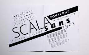
Before creating a type specimen i decided that looking at already existing specimens would give me good idea of what were the more successful ways of presenting a typeface to best represent and promote the type.

Initially i went to google to find a few different ways such as using the typeface to create different shapes, using the typeface to write out bulk text showing its legibility and also simply laying out the typeface a-z next to the types manifesto.

The more interesting type specimens consisted of more interesting shape, texture and colours that really showed off the versatility of the typeface. Here are a few examples i found the most interesting: 


I found that the most interesting type specimens were the one that used colour to make the typeface stand out when on a poster. This worked well for posters as the information was limited so the eye could concentrate a lot easier even with the mass of colours. The specimen that were booklets worked better when they had lots of blank space and created interesting compositions with the type. This made it more successful because the blank space make the eye concentre on the type rather than the image, this allowed for the type to be spread over numerous pages and still flow.

From looking at these two different approaches at presenting my typeface i have decided that i am going to create a poster for my type specimen as i think that it would allow me to included lots of detail in a small space to create a high impact, for what is a delicate typeface design.   


studio brief 2 manifesto

After creating the manifestos of all the existing typefaces that we have to base our designs on we had to write out own manifesto about out typeface, and also name it.

Vacilante

Vacilante is a bespoke typeface that is an adaptation of the classical Baskerville typeface that was originally created in 1754. It is a delicate adaptation with thinner strokes that contrast with the thick strokes that are at the bottom of the letter form. This create a hesitant feel to the typeface as the lower parts of the letter forms look reluctant to rise. This bespoke typeface could be used for sensitive subjects such as bereavements, and health care leaflets and booklets. Also similarly to the original purpose of the Baskerville typeface it could be used for books and publications.


studio brief 2 typefaces manifestos

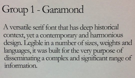
As a group task we were each group was given one of the nine typefaces to research and write a
short manifesto for. my Group was given helvetica.
The definition of a manifesto is a public declaration of policy and aims usually given as a speech 
or small paragraph of text.
Below is my groups interpretation of a manifesto for helvetica
The feed back we got from it was that we needed to describe the typeface style in a lot more detail, but the adjectives we used for the bit we did were good.


Here are the other eight manifestos for the other typefaces:


studio brief 2 design ideas

As a starting point i decided to draw out baskerville typeface a-f and draw a grid over it to to get the idea of the stroke widths. I then went on to change a few of widths of the strokes, to ensure it looked hesitant i had to vary the widths, some had to drastically thinner than the other. The higher the contrast in thickness the more hesitant the letter looked. I came up with a few different rules when transforming the letter such as: - lower parts of the stroke would be thicker as they want to stay grounded and are hesitant to more, and the higher parts of the stroke get thinner as they want to get away. - strokes that are  horizontal are thicker and the strokes that are curved or vertical are thinner.
Applying these rules gave me a starting point and helped my letters be consistent.
Here are three designs that i drew and change the width, and i also drew arrows to its clear to see the changes.
After drawing a few ideas i decided to recreate them on illustrator to see if they work digitally.

DESIGN ONE

This is my first design, i made all the strokes that were curved at the top of bottom of the rounded stroke a lot thinner, i also made the vertical strokes gradually thinner the further up the stroke i went. These few change subtly changed the typeface in to a completely differ style. The typeface doesn't look as sophisticated as the original as the strokes are inconsistent, because of the inconsistent strokes the thinner strokes could be seen as hesitant to be seen and the graduation of the vertical stroke could be seen as reluctant to rise. The overall look of the typeface development was successful as the letters look a lot more reluctant and hesitant then the originals, what i intended to do. 

DESIGN TWO 

                                     
For this design i decided that i would emphasis the thinker strokes of my first design at more, but 
this was unsuccessful as it made the typeface look bold and powerful, the complete opposite to 
my word 'hesitant'.

DESIGN THREE

This design is an adaption of my first design, i decided to experiment with the stroke thinkness a lot more using the rule at strokes that are horizontal are thicker and the strokes that are curved or vertical are thinner. This was easy to apply at it gave me a guid line of what parts to change instead of moving points and hoping for the best. The over all outcome of this typeface looked delicate and hesitant, but the 'a' and 'e' looked like they were from different typefaces, this made it unsuccessful as it is important that all the letters work well with each other and look part of a set.

DESIGN FOUR 

I decided to experiment with the italic Baskerville as the title of the right of the letters gave me the impression the letters were hesitant, as they were hesitant to be vertical. When transforming i decided to follow the rule were lower parts of the stroke were thicker as they want to stay grounded and are hesitant to more, and the higher parts of the stroke get thinner as they want to get away. This rule worked of this design unlike the design above as it looked a complete set. The overall look of the finial development looked, delicate, shy and hesitant, everything that i was wanting for the design. 

From these design only two i found that were successful and did when i intended to do with my typeface design, Design one and Design four. Both typefaces look hesitant, delicate and shy in style exactly what i wanted fro my design. The design i have chosen to develop as my final is Design one as the changes were subtle but still very noticeable, also i wanted the typeface to be used as headings or small amounts of bulk text but creating an italic typeface would limit its uses.


Friday, 13 November 2015

study task 3 drawing the detectives - book cover

As a study task i was asked to create a book cover for one of many Agatha Christie novel as part of the Guardians celebration of what would have been the authors 125th birthday. At random i chose the novel "Sad cypress." As i had not read the book before i had to research to plot of make sure my design was accurate. The story is about a series of murders taken place through jealously and over money, and in the end a murder is taken place by poison being put in someones tea.

I took some inspiration from already existing book covers 


this is my finical design. i decided that the design had took much detail and was too obvious and gave a lot of the plot away.


Here is my final design, i thought it was a lot more successful than my other as it was simplistic and had a limited colour palette so wast over complicated.