Initially i went to google to find a few different ways such as using the typeface to create different shapes, using the typeface to write out bulk text showing its legibility and also simply laying out the typeface a-z next to the types manifesto.

The more interesting type specimens consisted of more interesting shape, texture and colours that really showed off the versatility of the typeface. Here are a few examples i found the most interesting:


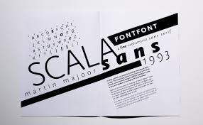


I found that the most interesting type specimens were the one that used colour to make the typeface stand out when on a poster. This worked well for posters as the information was limited so the eye could concentrate a lot easier even with the mass of colours. The specimen that were booklets worked better when they had lots of blank space and created interesting compositions with the type. This made it more successful because the blank space make the eye concentre on the type rather than the image, this allowed for the type to be spread over numerous pages and still flow.
From looking at these two different approaches at presenting my typeface i have decided that i am going to create a poster for my type specimen as i think that it would allow me to included lots of detail in a small space to create a high impact, for what is a delicate typeface design.
No comments:
Post a Comment