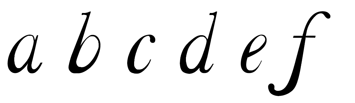
 As a starting point i decided to draw out baskerville typeface a-f and draw a grid over it to to get the idea of the stroke widths. I then went on to change a few of widths of the strokes, to ensure it looked hesitant i had to vary the widths, some had to drastically thinner than the other. The higher the contrast in thickness the more hesitant the letter looked. I came up with a few different rules when transforming the letter such as: - lower parts of the stroke would be thicker as they want to stay grounded and are hesitant to more, and the higher parts of the stroke get thinner as they want to get away. - strokes that are horizontal are thicker and the strokes that are curved or vertical are thinner.
Applying these rules gave me a starting point and helped my letters be consistent.
Here are three designs that i drew and change the width, and i also drew arrows to its clear to see the changes.
After drawing a few ideas i decided to recreate them on illustrator to see if they work digitally.
DESIGN ONE

This is my first design, i made all the strokes that were curved at the top of bottom of the rounded stroke a lot thinner, i also made the vertical strokes gradually thinner the further up the stroke i went. These few change subtly changed the typeface in to a completely differ style. The typeface doesn't look as sophisticated as the original as the strokes are inconsistent, because of the inconsistent strokes the thinner strokes could be seen as hesitant to be seen and the graduation of the vertical stroke could be seen as reluctant to rise. The overall look of the typeface development was successful as the letters look a lot more reluctant and hesitant then the originals, what i intended to do.
DESIGN TWO

For this design i decided that i would emphasis the thinker strokes of my first design at more, but
this was unsuccessful as it made the typeface look bold and powerful, the complete opposite to
my word 'hesitant'.
DESIGN THREE

This design is an adaption of my first design, i decided to experiment with the stroke thinkness a lot more using the rule at strokes that are horizontal are thicker and the strokes that are curved or vertical are thinner. This was easy to apply at it gave me a guid line of what parts to change instead of moving points and hoping for the best. The over all outcome of this typeface looked delicate and hesitant, but the 'a' and 'e' looked like they were from different typefaces, this made it unsuccessful as it is important that all the letters work well with each other and look part of a set.
DESIGN FOUR
I decided to experiment with the italic Baskerville as the title of the right of the letters gave me the impression the letters were hesitant, as they were hesitant to be vertical. When transforming i decided to follow the rule were lower parts of the stroke were thicker as they want to stay grounded and are hesitant to more, and the higher parts of the stroke get thinner as they want to get away. This rule worked of this design unlike the design above as it looked a complete set. The overall look of the finial development looked, delicate, shy and hesitant, everything that i was wanting for the design.
From these design only two i found that were successful and did when i intended to do with my typeface design, Design one and Design four. Both typefaces look hesitant, delicate and shy in style exactly what i wanted fro my design. The design i have chosen to develop as my final is Design one as the changes were subtle but still very noticeable, also i wanted the typeface to be used as headings or small amounts of bulk text but creating an italic typeface would limit its uses.
No comments:
Post a Comment