Friday, 28 April 2017

Studio brief 2 Final product range for distribution

A3 poster

Information pack and a5 flyer


Information pack


My final product consisted of a information pack contained in a folder with two packets. In the front pocket was a leaflet with important contact numbers in as well as a booklet of questions that the patient may want to ask the consultant or doctor. In the back pocket was a diary, that allowed the user to write down important information in its headings of appointments, medication, contacts and notes which was requested my the carer that i was in contact with. In the middle of the the folder was two booklets that were attatched to the center, these booklets contained infromation under the heading of ‘caring for the carers’ and ‘common side effects of treatment’. 


If I had chance to remake certain elements of my design Id chose a different card for the outer sleeve of the folder as my choices were limited in college and it would be different if it was mass produced, as I would make/design it to use a more durable card. Also if it was to be mass produced it, it would be stapled within the centre rather then sown however I really liked the sown booklets with in the information pack as it made it more personal. But overall I believe I have created a really useful and effect pack that would be very useful and relevant towards hospitals, doctors, carers, and patients. 


Thursday, 27 April 2017

Project report


Studio brief 1

In cold blood
I chose to undertake the penguin adult non-fiction book cover brief as I thought that this brief would allow me to explore the use of imagery to represent a story, as well as improve and develop my typography skills for communication. Problems I found with this brief were finding the line in which the imagery was inappropriate and in poor choice, this was a sensitive area as the books story is on a true horrific event. I found receiving group feedback on my develop designs helped my submission as the suggestions I received really help to develop and improve my design. What I have learnt from this brief is that the use of appropriate image is important, as risky imagery determines the success of the design.

Ohh deer card brief
I chose to undertake the ohh deer card brief as the brief was very open to the designs which were submitted, this allowed me to make my own brief which determined the outcome. When completing this brief I found that research was key to the success of my design as it influenced the style of card that I created. I found that the company sold cards that were very illustrative and humorous, because of this I tailored my design to this aspect. From the research that I did and the developments I think that my design is a successful response to the brief as it was humorous and a key part of the design was an illustration. From completing this brief, It emphasised to me that the research can be and is a key part of the influence in your design, I also improved my illustration skills using illustrator and photoshop.

Lca film poster
I chose to undertake the LCA film society poster of bird man as the brief was very open to the style of the response, I chose to complete the brief in a day as the brief wasn’t very large and I wanted to test myself on how fast I could develop a successful piece and meet a restricted deadline. The outcome for this brief was a success as the poster communicated the intended information and completed its purpose. The problem with the brief was that I had not seen the film but I did not let this stop my design as there was research that I could do to find out the plot of the film. This research was key to my design as without it I would not of been able to complete a poster for the film bird man. The skill I have learnt form undertaking this brief is to work to a restricted very short deadline. I was impressed with the outcome that I produced in just one day of development.

Ycn orchard pig
I chose to undertake that YCN orchard pig brief as the brief sounded interesting to me as I wanted to improve and develop my skills in creating promotional materials. I also chose the brief I had prior knowledge of the brand of cider. My responses to this brief were successful as I created a range of promotional products that were used as a collection to promote people to interact with orchard pigs social media accounts as well as promoting what their favourite craft cider was. The problems with the brief were creating a response that reflected the company’s current branding as well as their values and reflect the company’s energy. From this project I learnt that how to create a range of promotional products that can be used in a range and also learnt the importance of the placement of promotional materials.

Studio brief 2

Uk greetings
I chose to undertake this brief as a collaborative project as I thought that it would be beneficial to work with someone else to create a response that was as developed as possible. I chose this brief impractically as I liked the idea of creating a design that could be turned into a collection as well as designing something that I would want to buy as I find that the cards sold in shops are very gender orientated. The successful part of this collaboration was the final outcome and that I improved my typography skills by creating my own typeface. Problems with this brief were with my partner as I was left to do most of the design work with little guidance from my collaborative partner. Communication with my partner was limited as meeting would be delayed and sometimes cancelled so the only constant contact we had was over facebook and email. What i have learnt from this project is that working collaboratively is hard when in person contact is low, but it helped that we both understood each other ideas. ­

In this module I have improved a range of my design skills and experience what it is like to collaborate with another designer which will enhance my future design work. I learnt the importance of communication with people in meetings as well as the importance of research when you are not clear on a subjects topic.

Monday, 24 April 2017

studio brief 1 final design

This is the final design that I created for the Studio brief one, overall I think it a very effective poster as it is successfully in conveying what people associate with the christmas market and what products are sold there. Through out the production of this piece the most time consuming part of the design was creating the Lino although it was effective, I created a lot of mistakes while cutting the Lino causing me to redo sections multiple times. I also unfortunately did not get to take a photo of the final print before handing due to time restriction. Due to this I had create a digital mock up of the poster I created for the German Market, Studio Brief one. If i had chance to redo this piece I would change the typography so that the leading between the lines was a lot closer together so that the typography flowed easier.

Thursday, 20 April 2017

studio brief 2 thinking about distribution and creating a range


To make the information pack more of a range I decided to create posters and posters to make is a range, as it wanted to link back to the original information pack I used the same pattern and layout that I created through out the information pack. To promoted the distribution of these packs the posters and flyers would be through distributed to hospitals, doctors, carers and Leukaemia care.


Both of these posters and flyer help to promote the distribution on the product in its appropriate place as well as making my design part of a range, this is important to the final information pack as it created more of a campaign effectively supporting the information pack.

Tuesday, 18 April 2017

Studio brief 2 further development


Unfortunately I had to take out the contacts from my Caring for Carers booklet as the publication needed to be in multiple's of 4, this however proved useful as it made the important contacts easier to find as they were a separate document within the folder.


Unfortunately due to timing issues and printer malfunctions I had to edit my publication into a slightly smaller size then A5, due to this factor I had to redesign my entire folder and information publications within the folder so that it would properly fit the the paper that had to be used to produce my publication. 

change of size (smaller size a5)


This however did not effect the overall astatic of the folder and publications as the layouts were edited to fit the page size and still stuck with the same two column design layout which effectively worked before. After receiving feedback on my altered design they believed the paper size change did not hamper the overall legible and design ascetic of the folder/publications. 


Sunday, 16 April 2017

Studio brief 2 folder net


Above is the working and original net which i prototyped and adapted by widing the spine so that it could combined the two folder designs, this would need to printed on A3 card due to the folder been A4 but I ended up needing to print on A4 so it was cost effective which meant I had to change the net. Above is the adapted net where the tabs are printed separate so they can be attracted to the main design as I was restricted by the size of A4.


Above is the adapted net where the tabs are printed separate so they can be attracted to the main design as I was restricted by the size of A4. This still works as it does not hinder the design of the folder but allows me to print in a more cost effective way, this would not be a restriction if this was to be mass produced.


Wednesday, 12 April 2017

studio brief 2 development of product

patterns 
To begin with I began developing a pattern that consisted of daffodils as this was relevant to my subject matter of Leukaemia as it is the flower which represents cancer. I decided not to chose this pattern as the booklet was for everyone and after some feedback they believed it to be a bit feminine which was not intended, also when discussing this design it was suggested to try making a pattern with blood cells which I trailed. 

Hear is the first design of the blood cell pattern, I created it similar to the daffodils pattern in that it flows across a large area, this was so that the pattern could span across a spread. I then decided upon what colour to create the pattern in.


The first colour that I tried was red because of the cells it represents, but after some feedback they thought that the red was too strong and clinical and that it could create discomfort amongst the reader especially if there a patient. Another suggested that they looked a lot like tablets which would also be too clinical for the booklet that I am trying to create.

Taking this feedback on board I changed the colours of the blood cells so that they were multicolour so that they would be less clinical and not look like tablets. I believe the multicolour was successful in doing this as although you can still tell there blood cells it has become more a pattern and it is far less clinical then before.


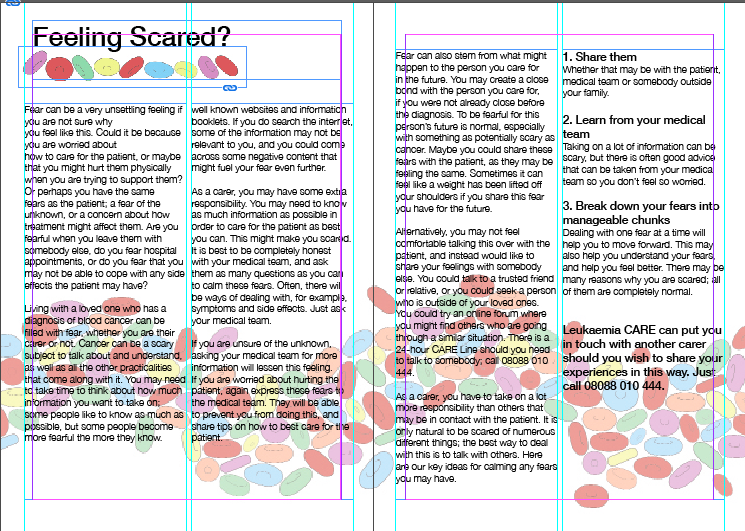
The next stage in my design was to create and layout the information that consisted in my Caring for carers publication, the grid consisted of a two column grid and when needed I added quotes and enlarged them so that the important information was more clear and legible.     


The next stage of my design I added titles to the pages and added the pattern in the background which flowed across all pages of the publication. To further use the pattern that I created I placed the pattern in a line under the title of the section to use as a underline of the typography. 


The next stage in my design process was to create a diary section for my publication, this consisted of a similar layout as the pattern still flowed through the background of the spreads. Each section of the Diary consisted of pages that were dedicated to Appointments, Medication, contacts and notes. Each section had a individual design so that they could be used read easily and effectively and understood by anyone. This was so that they could used by anyone, this consisted of clearly marked sections so that medication names, appointment times and contact details all could easily understood.


The back cover to the publication consisted of the same pattern that was used through out the publication, I also placed the NHS and Leukaemia Care logo on the page as I had created the entire publication with the information provided by both parties. After finishing the above design ideas I spoke to a carer to ask of their opinion on the design I had created, the feedback that I received from them was positive as I had covered a lot of information in the publication and the design was very legible and easy to navigate. They also really liked the design that I created for the Diary as they thought that it included the right topics that they usually need to take note of.


Tuesday, 11 April 2017

studio brief 2 collection of information


 As stated in previous posts Leukaemia Care is my primary source of information that I have based my publication on, as they provide the most in detail information for both carers and patients. I chose this website because it is very welcoming, friendly and it clearly and effectively provides information to all things relevant to Leukaemia.


With in my information pack the caring for carers is my primary source of information, it provides many great sources of information such as feeling anxious to about Leukaemia care in general. I chose to base my publication on this as it provided all the information that in my research I found carers to find the most relevant to what help and support they would like. I believe that the blue that is used in there publications is not very inviting as the NHS primary colour is blue and I wanted to separate my work from been to clinical. As my publication largely consists of information largely gathered through Leukaemia I will have to place there logo on to the publications.

Saturday, 8 April 2017

Studio brief 2 folder mock ups


This is a simple and basic folder design in which a pocket is built into the design with a fold in the card which produces a protective layer to protect its content just like any folder would. This design is ultimately very effective as it simple to create, and it does its job in protecting the contents. The only issue that I can find with this design is that the pocket would have to be very large as there is a large amount of content that I want to produce for my publication. And this could cause problems with the design in the long run in causing the design to break from the amount of information and work that is with in the folder.


The next design is very similar to the first design but with an additional pocket to add more information into the publication, as the pockets are built into the outside card they both protect each other when closed allowing the content to be safe from being damaged. This design works a lot better as it allows for more information and designs to be placed within the folder.


This version of the folder is similar to a book as the documents/information is bound to the folder giving it protection from damage, this is an effective folder as it protects the work and can be made very easily. 
After feedback upon these designs, it was mentioned that they too agree with what I previously stated about the first design and that this one should be avoided so that it would not break. After this feedback, I have decided to combine the design of the second and third folder designs as both of these designs work very effectively and it is a unique design that I have not seen before. I also believe that the design user-friendly and is not similar to NHS styles of information packs making it far less clinical.