A key part of my research was looking at the typefaces that the nhs use and their identity guid lines as the product that i was creating was for their patients and the patients careers, so an insight into how they design their information products was an interesting insight.

I understand the importance of a unified and uniform approach when dealing with something in the size and scale of the NHS, however, I felt that the use of Frutiger was to clean and clinical when dealing with something such as Leukaemia and support around it. A much more colorful and friendly typeface would be more suitable to dealing with difficult issues. I also do not need to stick to the Frutiger as my work is not entirely NHS design, it is also co-created by Leukaemia Care.
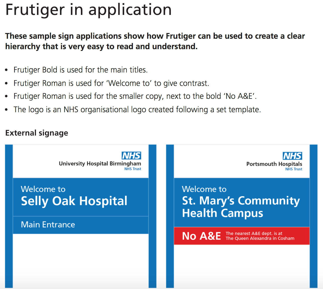


After reading through this NHS typeface design Identity (images above), I want to use a similar style of sans serif typeface but I don't want it to look so clinical and be accosted with the hospital/NHS too much which was established when talking about the project with an actual carer. I also don't want it to be too bold/extreme when convaying support.
NHS typeface identity: https://www.england.nhs.uk/nhsidentity/identity-guidelines/fonts/
No comments:
Post a Comment