Monday, 29 February 2016

bookbinding methods

When making my book i have to considerate method in which that i think is the most appropriate way of binding. Below are the different ways n which i have considered to bind my book and also the consideration of the appropriateness of them.

                                       
Concertina - this method of book binding is appropriate for books that have a good flow to when as there is no limited to how big or small the image is as it could flow across numerous pages, this method would ensure that my book had a good flow to the pages but would not allow for separation as i aim to have separate sections of my book with different subheadings.


hard front cover - this style of book is good for any kind of information as there is no limit on what the content could be of. The hard cover give the book the look and feel of and expensive and up market book, as the cover is protection of the pages, this would refer the consumer to interact and use  my book as i am encouraging them to write in it.


pamphlet stich - this style of book binding has similarities to the uses of it as the hard cover book. this binding method allows for many pages and is used for portrait books only was it does not work as well on landscape pages, Because i plan on making my book landscape to maximise the amount of space i have for text this method is unachievable.


Japanse stap stitch - this style of book binding once again but not limit the content of the book as it allows for as many pages as needed and the style of stitch can be changed as it is still the same method. This style is perfect for the binding of my book as there is no limitations of number of pages and also no limits on size as the number of holes can be adapted, also the style of binding does not add a certain feel to the book so people will dont be deterred from writing and interesting with the book, because of this this is my chosen method to bind my book.


Wednesday, 24 February 2016

spread layout research

As part of the research that i have done for my book i thought that it was important to research successful and creative double page spreads to gain inspiration from looking at them so that i could identify what makes them successful and interesting to read and look at. Below are the examples that i looked at to gain inspiration:


Good use of large text to fill a page and replace the need of image


creative use of type making the title large and in an interesting side ways composition, with small text in three columns.

also uses large text to replace the need for image to create a creative and interesting layout.

this layout uses 3 rows, the top and bottom row are uses to contain the large type of the title, and the middle row is used for the content that is contained in columns

a large image at the top of the page is used and spread across both pages, with the content text in 4 columns of what would be 6 columns creating blank space on what is a very busy page.

below are few other images that i also looked:


In my opinion i thought that all the double page spread that i looked at were successful in there own way as the content of them all was very different. The more successful ones were when a grid and set layout was used as that gave them order and could be applied through my book to create a good flow of the pages. 

After undertaking this research i have decided that i will not be adding images and it will be typography based with a few added diagrams, as i feel that images will detract for the importance of the text. I have also decide that i will create me pages landscape as it allows for large text and more colums.

Saturday, 13 February 2016

research of books

When conducting research for my book i thought it was important to look at eh tone of voice and appearance of already existing productivity books.

Below are the front covers of  7 different books that i found


All the above book covers all have a positive look about them created with the use of imagery and colour. The imagery creates a positive tone that is set for the rest of the book, but when looking in all of these books the content was set in chapters but was not presented in such a positive and inviting way unlike the front cover. This is a point that i want to address when creating my book as i want the front cover to reflect the content, positive, inviting and simplistic so it is not to look too complicated and unachievable. Out of the above the most inviting and positive looking cover for my was the study skills hand book that had large bold text as its front cover, there was no complicated false imagery and got straight to the point, which is important as the consumer always wants to know what the product is straight anyway without having to deduce for the imagery.

When researching these books i came across a book called 'steal like and artist' this was a small book that gives artist tips on how to reuse and take inspiration from other peoples work. I found this book very interesting as i found the style very inviting and relaxed and that it would be a book that i would like to read over and over again as the way it was structure was relaxed but ordered. The typeface is in a handwriting style that is still legible and gives the book its over personality, and sets the tone for the rest of the book straight away as the typeface is carried on all the way through the book.


The content used a mixture of relaxed pages that show diagrams and large double spread pages of text that are quotes, and then changed to large blocks of text that are broken up with headings that are in the same typeface as the front cover. The book has perfected the use of typography use two different fonts to control the tone of voice and importance of the text.
Another aspect of this book that i liked are the last page that was dedicate to doodling, this would go well in my book as when people are procrastinating the tend to doodle so i think it would be good to add a similar page as when people doodle they are taking their mind off concentrating on the problem but subconsciously are still thinking about it and are more likely to come up with a solution.


After looking at these book i have identified:
that i want to include a doodle page at the end of the book
have a relaxed but ordered tone of voice to my book as they are suggestions not instructions
have limited imagery and make the title page straight to the point and positive


Friday, 12 February 2016

finals

Below are the few that i have decided to take into consideration to send into the competition:
Design 1
Design 2
Design 3
Design 4 
Design 5
Design 6

Out of the above design i have decided to send submit design 1 and design 4. I choose both as i could decide which one i thought was the most effective. Design one is effective the design/pattern is very discreet in appearance to hide the literal design, and i chose design 4 as i thought that i was a different approach to illustration the lyric 'meet me halfway' and that only big fans of the band and the song might pick up on. 


Unfortunately none of my designs were chosen.


Thursday, 11 February 2016

Developed ideas


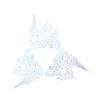
As a development from my original church design i decided to change the line colour to see if that would change other overall aesthetic of the design, unfortunately this didn't change the design much but i found that the lighter lines highlighted the geometric shapes a lot betters so they were more prominent.  


Above are my developments of the church design, when given feed back it was mentioned that the church would look better in a pattern so i created the top image were i used 3 of the basic church outlines and created a triangle in the centre to create a form. I then decided to layer the design using different colour out lines of the church, these developments are the bottom two images, i fount that 2 layers of churches(bottom left) worked a lot better than the other developments are it created depth an interest as well as a pattern. 


After creating the patterns and overlays i decided to add a gradient the the layers as the colours were limited and i wanted to see what effect it would have if i was to gradually fade in the 'clearest blue'. This effect was more successful on the left image as the fading in was more prominent because of the use of different blues. 


To further develop my designs i decided to see what they looked like on a coloured background, experimenting with and without the gradient. I found that the grey looked nice as it allowed the blues to gradually fade in but the blue background with the white pattered stout more as it had the higher contrast and the small colour change gave the sharp geometric pattern a soft look. Out of the above designs i thought that the bottom left was the most successful as the gradient worked well on fading in the blue and softening the overall look of the design, and the grey added depth to the background.

I then decided to experiment by using a print out of the line in black and move the print out along the glass as it scanned so that it distorted the image, to create a similar effect to the one i create on illustrator for the study task. below are the results:

After getting these results i decided to see what they looked like overplayed on a coloured image of the church to see what effect it would have, below are my developments:


The above developments unfortunately were not as successful as i had hoped as the effectiveness of the coloured church was lost with the overlay of the scan.

After the unsuccessful experiment with using the scans as overlays i decide to try them on their own, changing the colour of the lines from what scanned as grey to blue.


The outcome was as above and was very successful as the church was distorted and the lines were no longer as harsh as before. The new shape and colour looked to represent a wave.
I then experimented with adding a gradient to the colour but this didn't add as big of a difference as i though that it would.


After experimenting with gradient i looked back on my previous feedback and remembered that a pattern was recommended and turned the distorted church in a pattern using 2 together and creating 3 horizontal lines to represent the stylised 'E' in chvches. This design worked well as there was a reference to the 'E' and also churches but in a distorted way so that it was not overly obvious.

FEEDBACK
I then received feedback on the about designs and it was mentioned that some of my designs were too complex and didn't need as much detail to get across my intended style, as they thought the more detail the more obvious it become and also that it became too much for the eye.

After receiving this feedback i decided to go back to one of my original designs and try to improve this to improve the effectiveness of the design. 
I decided to use my blue squares design and turn it into the shape od the 'v' and 'E' in the bands name, purely using blue squares. 
Above are my designs were i used the squares to create a 'V' on the left is the original using the same colours and to the right is the same design with a gradient applied. I found this design effective as the 'V' wasn't very clear straight away and was a loose reference to the stylised name of the band. I thought that the gradient 'V' was the most effective as the blues flowed a lot better, This was similar with the below designs of my representation of the stylised 'E' in churches.


After creating the above 'V' and 'E' designs i decided to experiment with combining the 2 to create a pattern, below are the results:


The design did work and was fairly effective as a pattern but was relevant to my aim of design and took away the effectiveness of the symbols that the shapes created.

Out of all the above experiments and developments i think the most effective designs were the church patterns and the simplistic 'E' and 'V' gradient designs as these implied clues as to who the band was but did this discreetly and well as looking nice a piece of design. The next step is to select the most successful designs and create a mock up of it on a record sleeve and choose which to send off to the competition.