After researching and identifying that i wanted to create a cover that related to the lyrics and didn't go too far into the meaning so it was more of a literal response i creates the following designs with this in mind.
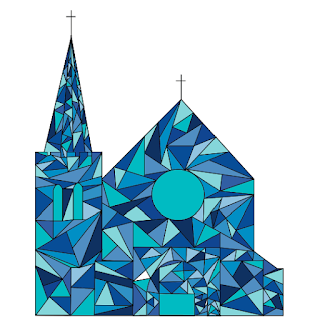
Created from the bands name and title of song. I created a literal response showing a church in a geometric style, similar to stain glass windows and then filled the shapes with different shades of blue that i considered to be clear blues. This was effective as it was a literal response and was easy to see what it was without it being too literal and simplistic.
created from the 'v' used in churches name and the title clearest blue. I created this literal response using squares to represent the shape of a 'v' and used different shades of the clearest blue to add depth and make it more aesthetically pleasing. This is an effective response as it is an interesting representation of the 'v' in churches but is not overly obvious as to the actual link to the bank its self.
Create from the the lyric 'meet me half way'. The design concept was that the sign was the half way point and that other lyrics were the directions, i was careful to to pick lyrics that were obvious as i didn't want to give it away too easy.
created from the lyric 'light its allover us' as a literal response as the person is created out of light bulbs all over him. this response is very comical as the illustration style is very cartoon like, and unrealistic. This style is the opposite of the style that represents the band.
create from the title of the song 'clearest blue' as a literal response as the design is made up of a range of blues that could be considered as the 'clearest blue' with a select few squares of white to add range.
this design i successful for representing the idea of the clearest blue without actually using the title in it, although the overall aesthetic of the design looks similar to tiles found in a bathroom.
After creating these designs i asked for feed back on what they thought i should take forward to experiment with further. They thought that the church design was very successful as they liked the geometric style and through it worked well with the idea of stained glass windows style, But mentioned that it a little too literal and suggested trying fading the design or using it as a pattern.


No comments:
Post a Comment