

After creating these icons i placed them into the wire frame to see what they looked like. Once placed in i found that the icon worked well as they were recognisable, so did their intended purpose and also make it start to look more like an app. After further consideration i decided to experiment with the placement of the icons along the bottom as the looked unnecessarily large.


Icons colour changed


Originally the colour of the icons were black to contrast with the white and make them stand out, after showing this to a peer they suggested changing them to a more subtle colour as the black was too much of a contrast and would make them look over powering compare to the products and also made the app look unprofessional as they didn't look sleek enough, this was a valid point as didn't want the icons to distract the user while looking at a product as this would slow down the efficiency of the app and make the app look unprofessional. From this feedback i experiment with different colour and decided that a grey would be most appropriate as it matched the colour scheme, but also wasn't as bold as the black but was still noticeable.
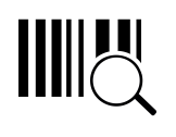
After changing the colour of the icons on the main icon bar i continued by changing the other icons colour so that they were all the same and looked like part of a set. As well as changing the colour i decided to change the barcode scanner icon also as i thought the design was unnecessarily complicate compare to the other icons and didn't look part of the set. To make the icon look part of the set with the other i decided to make it simple by using the barcode lines and putting them inside the circle, this was an appropriate change as the icon now looked like the others that it will be along side i the menu bar.


After showing my icons to a peer for feedback they questioned me on why i choose a star over a heart for the favourites icon, my answer was that id seen on other apps and thought that it was a popular and familiar icon to use, their opinion on it was that the heart you also be familiar as it also is used for favourites and that it would would be favourites over the start for an app aimed mainly at women as they saw it as a very feminine touch, i also agreed with their opinion and feedback as i thought it would also add a more personal feel to the app and not be generic using a popular icon, because of this i decided that i would change the icon to a heart.


No comments:
Post a Comment