Amazon prime tv interface
The interface of amazon prime tv is an example of bad ux and ui. It is a not successful as a UI as the interface is very complicated to use when it need to easy and quick as people want to be able to brows through the programs with easy and speed which this does not allow for, because of the bad UI the overall UX is also bad as the consumer will get frustrated with the slow browsing and eventually give up. The home page of the interface is also a problem as it is uncensored unlike other similar services and this will allow under age children to be exposed to images that are not suitable for them.
the guardian website
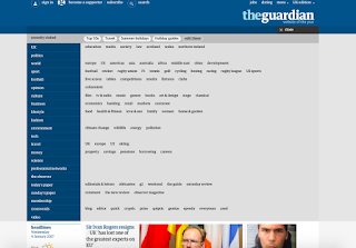
The guardians website is a good example of good UI and UX, the interface is simple to use as along to top of the page are all the subheading. In the menu is the list of subheadings again but this time with new topics related to the heading, this allows the user either quicky select the section they would like to look at or quickly navigate to a more specialist topic they wanted to read. The home page is a scrolling page that has sections showing news from a select few headings, but also allows you hide anything to do not want see, which could be used as a sensor or to just make what you want to see.
At the bottom of the home page there are the usual links to contact us, and sign up, but also links to sharing on social media so if you have read something you want to share you can quickly share it on social media. Also at the bottom are the heading that are at the top of the page, this allows you to quickly navigate to a different page even at the bottom on the home page without having to scroll to the top again. A handy feature that the page also has is a quick scroll button at the bottom of the page so that you can quickly get back to the top, this allows you to navigate with more efficiency.
Legwork
home page
menu
pages from menu
animation - pages from
interaction
Legworks website was a very good example of UX and UI. The website was very vibrate and had lots of personality which assume is a good reflection of the company. The most the pages on the website had some sort of animation on them. A feature that the website had that i thought was successful was the menu, it was along the right side of the page and popped out when you hovered the mouse over it, the menu its self contained limited headings. on further investigation when scrolling down the page i found that it was also scrolling thought the menu. This is a nice feature because if you didn't know what you were looking for in the menu you could scroll though it without having to keep going back to it. The headings of animation and interaction had the same style and format but what i particularly liked was that they animated onto screen.
What i have taken from this research is :
- menus need to be quick to use
- home pages shouldn't be over complicated or should be able to customise
- efficiency is key to the success of the UI and UX


No comments:
Post a Comment