Tuesday, 26 January 2016

ideas for leaflet

when considering what to base my leaflet on i came up with a few different topic and ideas:

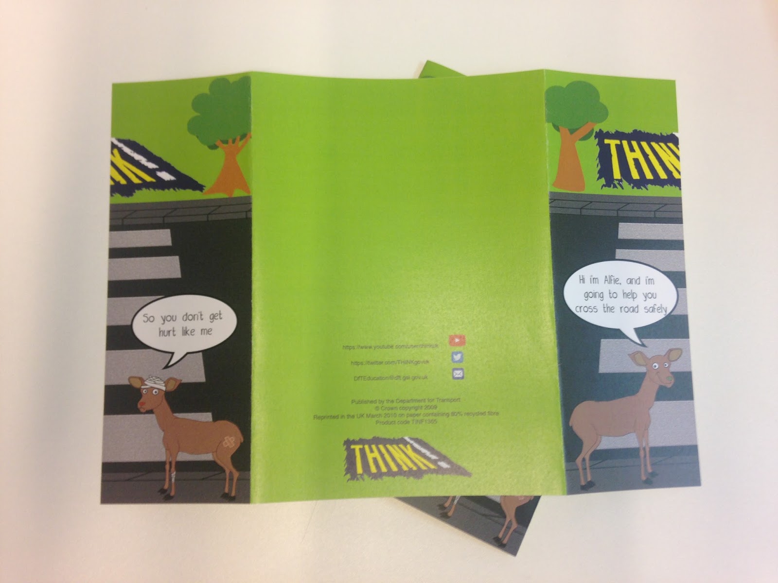
leaflet with instructions on how to create a complicated leaflet fold
leaflet on awareness of mental health
leaflet on awareness of global warming
leaflet about how to use and create grids
leaflet about comic and rbg
leaflet about post modernism and modernism

All these ideas would demonstrate what i have learnt so far such as how to create intricate leaflet folds, typeset, the use of grids and the use of colour.

Out of all these ideas i am more persuaded to create a leaflet that teaches someone how to create a complicated fold as that is one thing so far that i have found difficult to get my head rounded understand, but not only that i would have to carefully type set the type so that it was not over complicated to confuse the consumer, and when creating this a lot of the things that i have learnt will be put to use and considered.
I also like the idea of creating this as there is a gap in the market for these kid of things as most leaflet folding tutorial instructions are in books or on a website with purely works and diagrams, and are not physical leaflets that guid you by making it into the fold.

example of web tutorial :
http://www.wikihow.com/Fold-Paper-for-Tri-Fold-Brochures

This tutorial is a good tutorial as the video creamy shows you what to do but the paper size and how far over to hold in measure meant is unclear so the instructions are not very accrete.

https://www.youtube.com/watch?v=KEXYqRit9JY

This tutorial is shows you how to create a one piece booklet/8page zine with the gentlemen talk over the video of his hands that are folding the leaflet. The instructions are only clear as there is a visual and they would not work without. 

Web based tutorials are good as you can create the thing they are showing you but it is hard to create an accurate piece as they never given any precise measurements. Also the speech/text would not work if there was no images/videos along side it.
This is an issue i want to try and solve by creating a leaflet that not only tells you how to make it but shows you with the instructions and the things on the page, as well as be something you can keep once you have gone through the tutorial as a good reference if you were to make it again.


Monday, 25 January 2016

Final of leaflet and evaluation


To the side is my final printed information leaflet for this brief. I intend this leaflet to be given to children of the age 3 to 7 years and be used as a reference point for information on how to cross the road safely.
When undertaking this brief there were many aspects that I had to consider, such as target audience, size, colour, legibility, layout, order of information and also materials. Keeping these design decisions in mind I was constantly changing and experimenting with the layout and order of my type, and also when deciding on a layout for my game that didn’t over complicate the pathways.
Skills that I learnt while undertaking this project are how you use InDesign to create a document that is double sided and also import images and placing them in, these skills were learnt in my InDesign induction, because of these skills I was able to create a high quality print for my final.

If I was to develop with project, I would create a poster to back up my leaflet. Things that went wrong in my development were that some printing of my finals were pixelated which lead me to go back and change the resolution so that it would not effect my final print.   

Sunday, 24 January 2016

OUGD404 - Study task 8 - Type setting

As a task i was asked to typeset the poem the mouses tale in a post modernism way and a modernist way, to give meaning and better type set.

Below are my developments of typesetting using a grid to create a modernist approach.


It was revel hard when typesetting in a modernist way to create a neat rag as the sentence lengths varied a lot and when some were combined they lost there effectiveness. so with a lot of trial and error and different layout of layout the type of aligning to different gutters on the grid, i achieve the about design that i personally think it the most scuffle as it that the best kerning and the most controlled rag out of all the typesetting development i had done, it also looks to have the cleanest and sharpest lines.

Below are my developments of typesetting using a postmodernism approach.

to start off my design of type setting i decided to create the outline of a mouse as the poem is about a mouse and thought it was very appropriate. i then pasted in the text and experimented with the the alignment to the left so that it followed the shape.

typeset 1
typeset 2 
typeset 3
typeset 4
After deciding to use the shape of the mouse head i also found this very head to control the rag so that the poem still read the same. the most successful type layout in my opinion was typeset 3 as the rag is very controlled and you can still recognise the shape of the mouse as the tiles still looks like the mouses ear. Although this was the most successful typesetting for controlling the rang the typeset 4 was the most successful at looking like the shape of a mouse as well as keep the structure of the poem and not changing how it is read.


Saturday, 23 January 2016

leaflet research

After being given the brief of creating a small publication leaflet, the first thing i state to do was to look at already existing leaflet styles and folds and also the information that they contain to inform my design. 
Below are a few images of the leaflets that i found interesting and that have used an appropriate fold.

Folding on third over creating a large back space on on side that is perfect for imagery, the small fold on the left creates a small leaflet with a front and inside that is good for small bits of information. This leaflet fold is appropriate for the context and its information as it is for and exhibition so there is limited information needed and there is a large space to show an image to properness the exhibition. This would also be appropriate for other even and promotional material for companies.

Above is a leaflet that uses a concertina fold to present the information of how to eat fit. This is an appropriate fold as the leaflet has different parts of information about how to eat and be fit in different subheading so this fold allows there to be a separate page for each subheading with it being a chunky booklet. Also because the information all has the same alit to 'eat fit' the subheadings and separations still flow together across the page as it is on long piece of paper. This would also be appropriate for leaflet that are describing changes as the information would flow across the page, or also for a leaflet with large images telling a story.


About is a leaflet that provides important information for the 'epic awards' the leaflet has a simple but effective fold as the two sides conceal the inside information and pull apart to open up to the inside information. This is effective as the invite needs little complications to design but the simple fold is effective as it is interactive for the consumer.

Looking at these leaflets really emphasised the importance of the use of folds and how different folds can be used to represent and present different things effectively.

below are a select few other leaflets that i found very inspiring 


types of different folds and possible appropriate content

Half fold or single fold - informative leaflets that include important information that is quick and easy to read.


Tri-fold or letter fold - similar to half fold/single fold uses but a more complicated design that allows more separation of information.


Z-fold/small concertina - could be used for information that is fast moving and tells a story as the paper flows, could be used for informative and also presenting work/imagery or the flow of a process.

Gate fold or window fold - used for all kinds of content is a very versatile fold as there is a front and back and also large space for imagery and bulk text.


Double parallel fold - similar uses as z-fold,but best used for large imagery as it folds out to full a4/a3 etc so could be used as information for an event with a promotional poster on the back.


8 page zine fold - used so creating a small booklet without having to bind, and can fold a large amount of text and image as it have multiple pages.


Thursday, 21 January 2016

OUGD405 Final leaflet deisgn

Below are image of the layout of my final design for my leaflet to promote road safely with the help of my characters Alfie and Freddie. 

Here is the unfolded side of the leaflet. The paper size is A4 so what once it is folded into the gate fold it is A5 size. In the centre is the contact information and also links that 'Think!' have that give additional information on road safely. on the left side is the right half of the front cover and on the right side is the left side of the front cover.

Here are what the two side look like once the leaflet is folded
Front

Back 
(included example of copy right information to make the leaflet look more official)

Here is the inside of my leaflet. to the left there are a list of tips on how to cross the road safely once you have learnt to basics from the questionnaire game in the middle. To the right is Freddie and a speech bubble with him stating how many children get injured very years, i decided to have the character saying the fact instead of a list as it is less daunting than a long list of statistics. I decided to use a lighter shade of the green (design 1 below) used on the front and back as i thought it would highlight the information more, but it just made the design look inconsistent, because of this i changed it to the same green as the others (design 2 below) as it looked a lot more consistent with the reset of the leaflet.

design 1

design 2


Leaflet development

When developing my characters for my leaflet i decided that the character should be a deer as they look friendly, and are considered the most vulnerable animal to get run over as the saying goes "like a deer in the head lights."
For my characters i decide that i would create two deers, one happy deer called Alfie who is safe and can cross the road safely, and one sad hurt deer that called Freddie.

Above is my illustration of Alfie the happy deer, Alfie has a green nose as green in the traffic lights it is the symbol for go, and resembles go that the deer is safe to cross, as well as having "strong emotional correspondence with safety."

Above is my illustration of Freddie the hurt deer who get injured crossing the road incorrectly. Freddie nose is red as red is the colour of the stop traffic light and is also associated with danger. The bandaged and plasters are a small indication of his injuries as would an actual illustration to young children of the actually injuries would be inappropriate.

To the left is my design for the front of the leaflet. It shows Alfie the larger/older, and Freddie the smaller/younger deer stood at a pelican crossing trying to ge to the green grass over the other side. Alfie is shown to be saying "Hi i'm Alfie and I'm going to help you cross the road safely" and Freddie shown to be saying "so you dont get hurt like me." The front is the introduction of the characters an briefly explains the purpose of the leaflet. To the left is the initial design/layout of the questionnaire game that is to be on the reverse of the leaflet. This leaflet is two side and will be A5 in size, i wanted to keep the information limited as i wanted to keep the children engaged in what they are reading and also learn something from it, as well as being small enough for them to keep and also go back and look at again.


After starting this design  decided i wanted to add a little more information to it as it was very brief, and did not include any contact information so that parents or guardians could research for more information if needed. 
Below are sketches of my planned new layout for my leaflet and also where i plan to put the added information.  

Front page (gate fold) here is where my initial front page design will go but will be split in two pieces 
Back of leaflet for contact information
Inside of leaflet, in centre will be the questionnaire, to the left will be tips and things to remember when crossing a road, and to the right Freddie will be facts what will be edited so they do not scared children, as the intent of the is to educate them not scare them into crossing correctly.

Design ideas

When deciding on the content for my leaflet I considered my target audience of children 3 - 7 years old, and keep in mind that to keep children interested I had to make the content fun and also simple so they would be able to understand what they were being taught. 
Taking all these into consideration I decided that creating a game like questionnaire, that starts with a question asking "what do you do when crossing the road at a crossing?" They then follow the arrows to what they think is the right thing to do. The answers and questions lead two illustrations of deers, one happy deer called slide that know how to cross the road safely and the other deer who's hurt and called Freddie, depending if they get the right answer they will be lead to Alfie and if not they will arrive at Freddie. Here is a plan of the layout for the game/questionnaire: 
                                                 
After creating this plan I decided that it needed re working as there would be numerous images of the deers all across the page and would make it look over complicated as it is for a young audience.

Re drafted layout: 
                                         

Above is my redrafted layou of the game/questionnaire. To simplify the look of the design I limited the amount of deers that would be used down to just two at the end and extended the arrows so that they reach down from the answer to the hurt deer (Freddie). This allows the questions and the illustrations to be bigger and more dominant on the page.

Related leaflets

After watching my public awareness video and deciding on creating a leaflet for it aimed at children ages3 to 7 years i decided to research already existing leaflets aimed at the age group to identify the key aspects that make them perfect for the audience.
Below are 4 examples that i found, all these leaflets have similar style of design, they are all cartoon illustrations, that have bright colours and short easily to read facts and sentences. They all have characters that the children can get their information from.


The most successful leaflets are the bottom two as they have a story and more illustrations to it, this is good for children as they like stories and this will keep them interested in the information and are more likely to remember something with a story than something that is just facts. This is a key aspect that i will be trying to include in my design as i dont want there to be an extensive amount of information, but enough for them to learn how to cross safely and engage with the leaflet. 

Study task 1 - Leaflet folds

As a study task we were asked to develop a leaflet for the contact information for flood responses. As a group we began the task by writing down the information in which we felt to be most important and creating an order. Here is the sort of the order we decided to go with...


This started with the title, emergency contacts, radio stations etc. We then formatted this information into a 3 fold leaflet in a concertina style, which when opened reduces the amount of water covering the drawing of a house to show the information bit by bit and the image showed the aftermath of the flood once these steps/contacts have been used. I think this idea is successful and work well as it was interesting and more engaging than the average public information leaflet, although the leaflet maybe difficult to keep intact in a flood because of the folds make it very delicate. 


From producing this leaflet in the task it has made me consider the order of the information that i am going to put on my leaflet as the order is very important, as you need the more important first.


Successful leaflets that i looked at to get ideas of how to lay out the information and in what order: