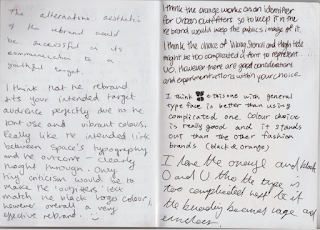
- that they like that the 'u' and 'o' created a symbol and that the alignment of them worked well
- they liked that i used the current orange colour that urban outfitters are using at the moment
- they liked the geometric modern typefaces
- they though the use of the different and complicated typefaces was too much for the design
- they thought a simpler typeface along side the 'u' and 'o' would work better
From this feed back if i was to improve the design i would take the advice of changing it to a simpler typeface along side viking stencil to add emphasis to the 'u' and 'o' and give it a cleaner finish.
Evaluation
In my final evaluation of my logo design i conclude that the design did for fill all the design aspects that i identified at the start of the project. My design clearly states the company name, and is readable. The design is also modern in style, also create a clear link to the current branding of the company by using the same orange. The logo could also be considered as timeless as it would still be relevant in many years to come as it reflects the companies fun shopping environment and quirky fashion.
Apply my design to mock up carrier bag showed how the branding would be used and how effective the design is. On one side is the full logo and on the other is the symbol that is taken straight from the logo. This shows just how versatile the design is and also how recognisable the design could become.
If i was to improve the design i would take the advice of changing it to a simpler typeface along side viking stencil to add emphasis to the 'u' and 'o' and give it a cleaner finish.


No comments:
Post a Comment