
Clarendon
- Slab serif
- thick strokes
- natural bold letter style because of thick strokes
- letters looks powerful and have a heavy impact, not very delicate

Berthold
- similar to clarendon but in a san serif style
- thick storkes put emphasis on letter,
- creates a big impact

Univers
- Thinner strokes then clarendon and berthold
- san serif, modern
- very legible

Bodoni
- Stroke sizes vary, some thick some thin
- serif font
- serif create a delicate feel

Caslon
- similar to Bodoni
- serif font
- stroke are very inconsistent some thin, some very thin and some thicker bolder strokes

Garamond
- Similar to caslon but strokes are lighter
- serif font, but serifs are small
- mixture of thin and thick strokes

Helvetica
- All the strokes are the same size,
bold/thick style
- san serif

Times
- serif font
- small serifs
- thick and thin strokes
- small serifs make the font look delicate
Baskerville
- similar to times also a serif font
- strokes a thinner than times, but still
have two different thicknesses
- very delicate with the thinner strokes and serifs
- typeface looks lighter than the rest
From looking at the 9 fonts and comparing them i have chosen to consider times and baskerville to base my typeface on as they are delicate and lighter in appearance than the others.


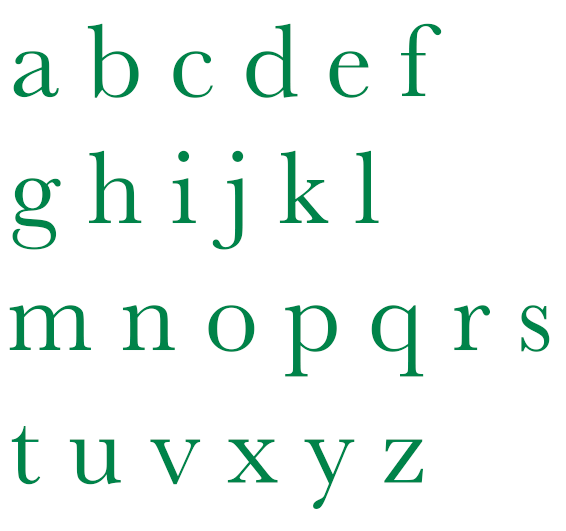
Green typeface - Times Black typeface - Baskerville
Above is my comparison of baskerville and time typefaces, by putting them like this i can clearly see the differences in the two typefaces and decided which is the most appropriate for my typeface stye "hesitant".
Times has sharper edges and strokes than baskerville, its serifs are more pointed, and stroke on the lower case g joins unlike the g of baskerville.
Baskerville has slightly thicker serifs, and g is completely different to times, where as all he other letters have similarities.
Looking at the two fonts in this comparison baskerville looks the more delicate font with its thinner strokes that make it lighter and more rounded edges similar to the aspects i identified that id want my type to be, therefore this is going to be the typeface is base my design on.
No comments:
Post a Comment