Below are my develop cents for my leaflet on drink aware for students.
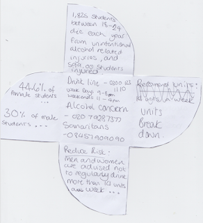
very first prototype of shape:
inicial layout out prototype
This is my initial design for my layout, it is a plan of the information that i want to include. after creating this i realised that the order that the information is seen in is important as it has a big impact on the tone that is created.
After creating these prototypes i started to digitally create my leaflet.
Above is my initial layout for what would be the outer side of the leaflet. It is a very basic layout the outlines the typeface and were things need to go as well as use of colour. The typeface used is helvetica Neue Medium and the text on the inside will be helvetica Neue regular, i decided on medium for the outside and initial facts that will be read first as i think it has a larger impact as i wanted to really get the attention of the audience, before they read on to the more serious and detailed facts. i choose to use black, red and white as these work well along side each other and create enough of a contrast that white text is legible on both red and black. I chose red specifically as is reference to danger and my leaflet is on the dangers of student drinking.
I further developed my finical design adding red text if the background was black, and black if background was red, behind the already while text to add depth to the writing and highlight the text and its importance. I also add the title of '101 of student drinking' 

I then laid out the information for the inside of the leaflet. Once again keeping the same colour scheme as the outside but this time adding a curved shape to the edge of the sides, singing red on the black sides and black on the red sides, This creates interest and looked more appealing. In the centre of the leaflet i decided to use a white background with black text and a red stripe of highlight the charity/helplines thats contact details were underneath. This information was important to the leaflet because the leaflet would be no use if it did not include information for were students could get help and advice from. After creating this design i printed it out to see how effective the design was.
printed fist design:
After printing this design i found a few mistakes as the text "about half of those students..." was the wrong way round when folded. Also the after "4 out of 5 students.." was visible behind the front page when the leaflet was folded this looked untidy and took away from the impact of the front cover.
I asked for feedback on this design and it was suggested that the centre white square could be used as a keep sake for peoples wallets so that they should always have in information it needed, i found that this was a good idea and something i would later develop into my design. I was also mentioned that the two layer text was a little too much for the bulk text and only seem to work well on the title as it was larger.
After receiving feed back on my printed prototype i altered the bulk text so that it was just a single layers of white text on a back ground which looked a lot better and made the title page stand out a lot more. I also decided to change the colour of the outside sides as i didn't think that the different colour ed sides was as effective as i intended it to be, so i decided to stick to the one colour of red to create a large impact.
I then corrected alignment of text "about half of those..." to that it is readable when folded.

I then decided to also change this inside of the leaflet colours so that the sides were red with black curved shapes as this was consistent to the outside being purply red but still adds the interest of the shapes. I then once again printed the design to see what needed to be improved next.
Printed second design:
After printing the above design i decided to ask for feed back on the effectiveness of the overall design. The feed back was that the title was slightly miss leading as some people thought that it 101 things of student drinks not 101 not the abbreviation of teaching the basics drinking, Therefor i needed to change the title. It was also brought to may attention again that the centre would be useful as a cut out for a wallet.
I then addressed all the issues that were mention in the feedback by adding dashed lines around the centre box and on the back the text ' cut me out and keep me, and you safe'. I also added '.co.uk' under the drink aware logo so that students were to know that they could receive information from the website as well as the helplines. The dashed lines were also added to the inside of the leaflet. I changed the title of the leaflet to 'know your drink' as it was sort and snappy, and to add interest i used the drawing of spirit and wine glasses from on the inside to replace the letter 'W' and 'I'. I think this worked well as it not only created interest to the typeface it soften the harsh text.


No comments:
Post a Comment