Tuesday, 28 February 2017

collaborative uk greeting development


From idea generation, we discovered a composition that worked well for each occasion. Following this we then experimented with colour of the collection, as we found colour is an important element which determines the target audience. Because of this we decided not to use gender associated colours as we didn’t want to confirm stereotypes. When receiving feedback from this concept it was discussed that the aesthetic was that of a luxury feel because of this we decided to use metallic colours as ordinary colours would not convey this aesthetic. 


After presenting out early design ideas and development in a crit, it was suggested that we open up our designs to more than just happy birthday and to possibly design our own gender neutral typeface. After receiving this feedback we decided that it was a god idea and the it would add a personal touch to the cards design. I then went on out adapt the bodoni typeface by thickening the strokes and shortening the serifs. By doing so i found that the typeface became a nice mixture of both masculine bold strokes and think delicate female strokes which were typically shown of card designs. When receiving feedback on this typeface from eve and other students they agreed that the strokes were a nice balance and that the adaptation really added to the design. 

below are the type examples


comparrison on typefaces
bodoni

new adapted typeface


After designing the gender neutral typeface i redeveloped the type composition swapping out the normal bodoni for the gender neutral typeface i had created. By chanigng the typeface the design instantly looked differnet as the design was very bold to start with but the change of typeface still had the bold impact but was more delicate and allowed the letters to connect better in the compostion. With the letters being able to connect better wit the new typeface it made the composition tighter making it look whole and not seperate. Although the design is tight the serif font increases the legibility of the type and allows the type to be readable in any composition. 


Bodoni
gender neutral typeface

 comparison


Collaborative uk greetings research and defined concept


The research we carried out we found that cards and wrapping accessories lacked gender neutral options, and were heavily image and illustration led. Card that were aimed at females commonly showed images of flowers, florals, hearts, cakes, dresses and were usually in either pinks, reds or purples with script font or elaborate serif fonts. Cards that were aimed at males typically had images of cards, beers, women, gardening and were commonly designed in blues and greens also with script fonts but were less delicate then the female cards as they were bold. From these findings, we decided to trailer the brief to being as gender neutral as possible to be as inclusive as possible. 


When designing we kept in mind the research we found and decided that including images and illustration limited the audience, so we decided that we would create a card range that used interesting type composition in replace of imagery. This left the intended audience open as it was not designed with a specific gender in mind, but would be designed to be given to anyone from anyone. We decided that this concept should not be limited to one occasion but be open to multiple occasions such as birthday, congratulation, happy anniversary and thank you.


To start the idea generation i designed a basic type composition to get us started, this was based on our research that we undertook and found that most cards have images and that decided which gender the card is for, because of this we decided that we would only use type. This design was a basic composition of the words happy birthday making sure the type was legible and still could be understood. The typeface that we started out using was bodoni as we both agreed that this typefaces strokes were neither masculine or feminine. This design then made us want to experiment with traditional letter press as when deciding to work together we said we wanted to experiment with traditional methods. We thought that letter press would create an aesthetically pleasing result. However because of the composition of the type we struggled to achieve the aesthetic we were looking for. After experimenting with letter press we decided to develop the composition further as we felt that the letters did not connect as well as they did on screen, we thought that this would be reflected in the design when printed even when digitally printed, because of this we decided to further develop the compositions so that the letters looked connected and could be read fluently in the composition.  


To confirm that our concept would for we decided to create a survey and ask people about why they choose to buy cards and if they think that a gender neutral card is needed. our results found that people liked the idea of a gender neutral card. 


LCA Film society poster brief developments


When research bird man the movie i found the texture on his costume interesting and wanted to replicate this are a texture for my poster. To do so i decided to shape paper into similar shapes that are on his suit, i then photographed this and edited it on photoshop, then created a pattern from this by duplicating the layers. this created a very nice repeat pattern the looked slightly similar to that on his costume, although as it was made from a photograph the colour was slightly dull. To made the colours more vibrant i add a filter over is on photoshop that brought out the colour a lot more and also created depth and texture to the pattern. To develop this design into a poster, i will add the birdman type that i created when generating ideas so that it communicates the movies name without having to guess from the texture.


LCA Film society poster brief research


As i am creating my poster as a quick response from found imagery of the movie i started by searching from images to inspire a direction for the poster. For this I googled the movie and found a selection of images of the characters in the movies as well as bird man in his costume. When looking at these images I noticed the texture on bird mans costume and like the idea of imitating it as a background for the poster. I also found a selection of bird man illustration and posters that other designers have created as well as the original. As well as looking at found imagery i watch the trailer as found imagery alone did not tell the story or give me enough inspiration. I found from watching the trailer that the character who was birdman lives a dark life seeking to be bird man once again, finding this out I wanted to try and reflect this in my design.


LCA Film Society Poster brief

The brief for lca film society was to create a poster to promote the film that they were showing. They have a different film every week so the aim of the poster is to promote the event to get students to attend. To do so the poster needs to include the films name, the time and the place that it is being shown. The poster i am going to design is for the film bird man and it is being shown at 4.30pm on Friday 10th of march. The deadline for the post is loose as there is no set date or time for submission just needs to be before the march 10th. The chosen designs are printed and posted around leeds college of art as well as uploaded as a post to the lca film society Facebook page.

For this brief i am going to treat it as a one day task as there is no set time limit or restriction to the brief. I will also use this to create a quick response based on found imagery from the movie.


Friday, 24 February 2017

collaborative practice

Discussion 

When we were all meeting people who wanted to do the same briefs as us I got into a Discussing with a fellow peer in graphics, we decided we wanted to collaborate together as we had similar interests but also felt we could learn some individual skills of each other as she was especially good with typography andIi wanted to improve my typography skills.
I also managed to get in touch with an illustrator who came to me about the brief and I introduced her to my collaborative partner, she who has an interest in collaborating on the brief so we thought we could incorporate illustration into this task. When discussing ideas further we decided that an illustrator would not be needed as we wanted to create a typographic card that was possibly gender neutral.


Task

Define what your motivation is for taking under this collaboration?
Because I want to develop my knowledge of understanding when using typography to communicate as well as for aesthetics. I feel this brief will stretch myself to experiment with using different and interesting compositions and typefaces to create successful designs that communicate.

How are you going to communicate amongst your group? Why would they be the best methods?

·      Using social media – Facebook, Email, Instagram as we both check our social medias as we both have personal and design accounts.
·      Personal – phone number, personal and direct very hard to ignore
·      In person – discussing ideas and problems in person in a group, we are in the same class so will be able to talk before and after timetabled sessions as well as out of uni time.

What skills sets does each individual have in your group, and what areas of interest’s do you have the a similar and what areas of interest do you want to learn?


Eve O’Neil – Strengths

·      Typography
·      Editorial design
·      Screen printing

·      Digital/ adobe

Learn -  wants to learn different practical methods as her work is very limited to purely digital design and flat screen design.

Katie Ayers – strengths

Geometric illustration/illustration
·      Editorial design
·      Screen printing
·      Book binding
·      Adobe packages

Learn –  I am veryInterested in typography but my typographic work is lacking in experimentation, and learn different ways of using type. By doing so I hope that it will largely improve my work and influence me to work in a more typographic style that takes risks.


What do you want to learn from this process?

I want to expand my knowledge in typography and its uses as well as learn how to work collaboratively in a group, evenly distributing the work and making the most of the other person's skill set.

Ideas

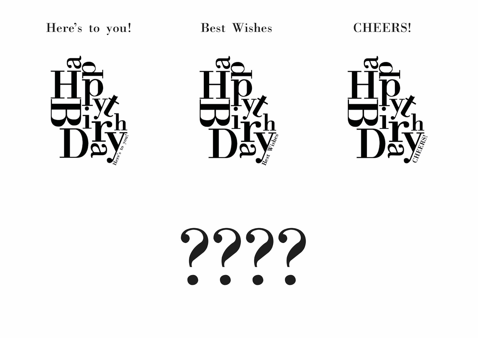
Topic – Gender neutral

Collaborating this project with another graphic designer meant that our way of thinking and tackling a brief was similar which my discussing ideas for the brief go a lot smoother. We decided that we needed to evaluate cards/paper/bags and other accessories that are already on the market so we could gain knowledge of what was missing from the market as well as the type of products and their styles. From carrying out this research we soon realised cards were very much either for a male or for a female orientated and that there was missing a style of cards that did not carry these gender stereotypes. when researching we noticed that a lot of the products looked a lot like they were for women and girls because of the use of script typography, imagery & choice of colours such as pinks, red's and purples.  We then looked into products aimed at men, which similarly to women’s products had a common style that was used for most of them, most the designs showed illustrations of beers, cars, and sports with either bold script fonts or bold serif fonts. 

Colour scheme ideas

When discussing colour scheme at the early stage it wasn't too difficult as from the research we found the pinks and red's were commonly used for women and blues and greens were used for men, because we had discussed the design bgender-neutralutral the immediate colours we thought of were; Black, white, silver & gold. The reason for silver and gold was to add something that’s not so flat on the card and added a aesthetically pleasing look to it, and the use of the colours silver and gold can come in handy with practical methods such as foiling & screen-printing and will add texture to the products.

UK greetings cards look: Illustrative, colourful, either girly, manly, older generation, immature


7 key aspects to collaboration

1.     Motivation – need to feel that they gain something from the collaboration.
2.     Communication – project needs to communicate clearly.
3.     Diversity – work with people who are in to different ideas of design.
4.     Successful- everyone has to have a sense of ownership from what you’ve done, make it clear on your blog what you did in the collaborative group.
5.     Support – collaborative needs to work on the trust of others in the group.
6.     Problem solving- need to be able to solve problems together in your group.
7.     Plan - your time management so you have enough time in all areas of the collaborative brief


Monday, 20 February 2017

studio brief 1 printing methods

Mono printing - Mono printing is a form of printmaking that has lines or images that can only be made once. Mono printing creates a simple one off pieces of work in which in my experience the colour does not properly create a solid shape and that it has a lot of texture, this relates to the style of work I want to create for this brief as I want create a handmade piece of design to tie in and represent the german market. 

Lino printing - Linocut is a printmaking technique, a design is cut into linoleum with a sharp knife and then ink is rolled on to it to create the design. Lino cutting is a relatively simple and effective method of printing and it creates a fully handcrafted piece of design which fits precisely what I want to create for my design.

Screen printing - screen printing is a printing technique whereby a mesh is used to transfer ink onto a substrate, except in areas made impermeable to the ink by a blocking stencil. Then a squeegee is moved across the screen to fill the open mesh apertures with ink to create the design. The style that the print technique creates depending on the inks used creates vibrant and a fresh just printed look, as well as a hand made look if you place textures into the design. 
fresh just printed look

Letter press - Letterpress printing is a technique of relief printing using a printing press, a process by which many copies are produced by repeated direct impression of an inked, raised surface against sheets or a continuous roll of paper. In which metal type, or wood type is used in type blocks to apply the design upon to the paper similar to Lino printing. Letter pressing would be perfect for the design that I want to create however with time restrictions I do not have time to be inducted into laser cutting in order to create the shapes that I want to use within my design.

Etching - Etching is traditionally the process of using strong acid to cut into the unprotected parts of a metal surface to create a design in the metal. Etching provides a unique texture and style in the imagery that it creates a aged look, similar to renaissance artwork. For this reason I did not select to go with Etching as I want to create modern and interesting piece of design.  

After considering all of these print techniques I have chosen to work with Lino printing, because after considering all the handmade effect techniques that can be produced it is the only method that I believe is truly fully handmade and crafted by me, which fully fits my design idea of handcrafted to represent the german market fully.

Friday, 17 February 2017

Penguin book cover final


For my final outcome I replaced the blood, with the images of the killers eyes along the top, this made the back not look empty as it previously did. After my crit i received a suggestion of adding a red drop shadow under the type in replace of the blood. This worked well as it added a serious and more sophisticated looked to the design than the dripping blood did but also made the bold type stand out more on the photograph on the front cover. The above design is the design that i submitted to penguin as my final design.

Thursday, 16 February 2017

Penguin book cover development


Above is a cover design that i created and experimented with the background colour. i used a photograph of the family on the front cover as i wanted the cover to be as representative of the family as possibly as this is a horrific true story. As the story was horrific and gory i added dripping blood across to the so the cover represented the story as visually as possible. The bold type across the family photographic is also representative of the story as the story is shocking and small print serif type would not give such a bold impact. After creating these designs i asked for feedback in a class crit, the Feedback from crit said : 
which colour to do you think is most effective for the cover? why? 
- majority of people said black as they think it makes the images and text stand out more on the page and that it gives the cover a sinister look 
general comments: 
-maybe make text a darker shade of white on the back 
- make the gaps between photos black, so its same as background
- consider fading photographs into background. i like that type choice but the blurb point size is a little large 
- not sure about central alignment of blurb on back 
- not sure on blood across top of cover, looks fake and doesn’t add much to design.

After receiving these comments i have taken them on board and intend to act upon them, such as changing the pt size of the blurb text and left aligning is to match the alignment of the cover. I Will also experiment with the blood across the top of the cover to see if i can make it look more realistic. I intend to keep the type over the photos the same as the feedback agreed with its impact. I will develop the design with a black background as the feedback confirmed that this design has the most impact and conveyed a sinister feel.


After receiving feedback on my previous designs, I decided to remove the blood as it did not add anything to the design and made it look fiction not non fiction which the book is. in replace of the blood i decide to experiment with adding photographs of the kills eyes are the top and bottom of the cover, this left no room for the text ‘a true account of a multiple murder and its consequences’ and the authors name, because of this i decided not to include it on the cover as it became crowded, because of this i experimented with putting these on the back cover the frame the blurb. This also made the back look crowded, but without it the back looked empty. When acting on my feedback i also left aligned the blurb to make it similar to the left aligned type on the cover, this made the book cover look more professional and worked well as a whole. 


Wednesday, 15 February 2017

penguin book cover idea generation


To start the design process i created the above designs to experiment with representation of the story. The top design uses bold text to create an impact on the page, and uses a bullet hole for the letter ‘o’.  This represents the brutality of the murder and the pain the family suffered. The silhouette of knife creates a cut in the page and also represents the murder of the family. This design is very basic as it has not been fully developed but i think the combination of the knife and the bullet holes is a lot for the front cover. The design underneath is a representation of the file interviews that capote did with harper lee from people about the murder. The bold type is in a stamp like font that i used to make the file look as realistic as possible. I choose to use a family photo at the top of the cover to make the design more personal to the family who were victims of the brutal murder. 

From these design's i will experiment further with the bold use of type and also try to include a larger more impactful photo of the family to make the design more personal.


Penguin book cover research


"The book tells the story of the murder of the Clutter family, consisting of Mr. and Mrs. Clutter and their two teenage children, Kenyon and Nancy (two older daughters were grown and out of the house), and the events that lead the killers to murder. The family was living in Holcomb, Kansas, and in November 1959, they were brutally killed, with no apparent motive, by Dick Hickock and Perry Smith. The family was discovered bound and shot to death, with only small items missing from the home. Capote read about the crime in The New York Times soon after it happened, and before the killers were caught, he began his work in Kansas, interviewing the people of Holcomb and doing extensive research with the help of his friend Harper Lee."

https://www.cliffsnotes.com/literature/i/in-cold-blood/book-summary


To start my research for designing this book cover i decided that i needed to have a clear idea of what the book was about seen as i had not previously read the book, To find out what the book was about i read a summary of the book on cliff notes. This told me that the book was about a multiple murder of a family done by two men who had no previous connection to the family. The family where killed in such a brutal way. After finding out what the book was about i decided that i would look as previous book cover of the book to gain an idea of what worked for the book and how far people have pushed the cover. The use of imagery of the family or the killers was popular and with the use of bold text and the colour red. These were all common design feature of many of the front covers. The more successful cover had large text that created impact, and a bold blood red colour as a representation of the brutal murder.  From this research i will use my knowledge of the book to guide my design decisions and also experiment with the key features that made the previous book covers so successful.