When developing my promotional bottle net tags I developed two different styles that the tags could be created in, I tried more than one so I could see which one sat upon the bottle better. The first design that I created was a simple rectangle shape with a cut in and fold section to be placed onto the bottle, the design revolved around been efficient with the paper allowing for the Orchard Pig logo to be centered on the design as the tag would cover the bottle's branding.
The second design was built around a cut out hole in the upper half of the design, I found however when I came to prototype the design, I found that it did not sit well upon the bottle neck. As the fold would bulge out and stick out rather than been sat on the bottle. Both of these two designs used the same tagline on the front of the tag ‘Something To Snout About’, the idea behind the tagline was to add a fun and different way of grabbing people's attention towards the social media campaign. I felt that the tagline was more in line with Orchard Pigs fun and adventurous existing branding allowing the bottle net tags to be incorporated into existing marketing material.
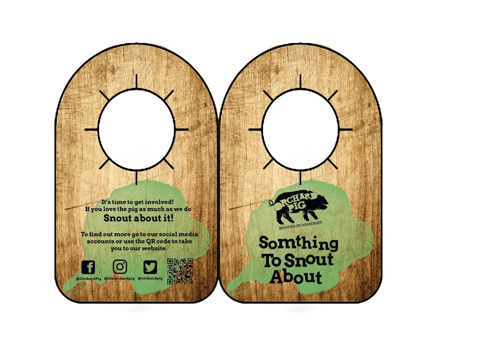

After creating prototypes of the previous designs I decided to develop the first design and expand and improve the design of the neck tag. Firstly, the size of the tab which would be semi cut out of the tag was increased, this was because the original design did not have enough room to properly fit upon the bottle correctly as the sides of the tabs that went around the bottle were too short. This fault was fixed within this design, with the overall size of the bottle neck tab been increased this allowed for the social media information on the back to be increased in size making the information more legible. With keeping to making the paper tag as efficient as possible, space the title of the flavored cider was placed above the Orchard Pig logo in which it was colour coded to the existing brand of ciders colour.

As the main focus point of the social media campaign, I developed pig noses that incorporated the overall key aspects and marketing features of the pre-existing bottles and names. Each bottle had a unique design created that would be part of the bottle neck tag, the pig nose could be removed from the tag and would be worn, and then take a selfie with the nose on. You would then upload the selfie to one of the three social media websites with the hashtags displayed on the tags and other marketing elements. This been shared with the drinker’s friends and the overall brand to boost social media coverage of the brand. On the reverse side of the tag, the removable snout was placed with the instructions of the social media campaign as well as the slogan and existing material of the bottle was placed.


The next stage of development was to carry the social media aspects from the bottle neck tags to a bar mat that could be easily altered to represent the various flavors of ciders that Orchard Pig offers. The bar mat would be given to the bars/pubs that sold Orchard Pig to help circulate the promotion.
The snout illustration was designed to be part of a Facebook/social media element to the brief, designed as the nose at the bottom similar to the previous snout personalities. The snout on post was plain as it was not meant to represent any specific flavor of Orchard Pig, the post would include the tag line ‘What’s you Perso’snout’ity?’ allowing the viewer to make there decision on which flavor of cider they preferred and which snout to use in there own social media posts.

No comments:
Post a Comment