


The research we carried out we found that cards and wrapping accessories lacked gender neutral options, and were heavily image and illustration led. Card that were aimed at females commonly showed images of flowers, florals, hearts, cakes, dresses and were usually in either pinks, reds or purples with script font or elaborate serif fonts. Cards that were aimed at males typically had images of cards, beers, women, gardening and were commonly designed in blues and greens also with script fonts but were less delicate then the female cards as they were bold. From these findings, we decided to trailer the brief to being as gender neutral as possible to be as inclusive as possible.

When designing we kept in mind the research we found and decided that including images and illustration limited the audience, so we decided that we would create a card range that used interesting type composition in replace of imagery. This left the intended audience open as it was not designed with a specific gender in mind, but would be designed to be given to anyone from anyone. We decided that this concept should not be limited to one occasion but be open to multiple occasions such as birthday, congratulation, happy anniversary and thank you.


To start the idea generation i designed a basic type composition to get us started, this was based on our research that we undertook and found that most cards have images and that decided which gender the card is for, because of this we decided that we would only use type. This design was a basic composition of the words happy birthday making sure the type was legible and still could be understood. The typeface that we started out using was bodoni as we both agreed that this typefaces strokes were neither masculine or feminine. This design then made us want to experiment with traditional letter press as when deciding to work together we said we wanted to experiment with traditional methods. We thought that letter press would create an aesthetically pleasing result. However because of the composition of the type we struggled to achieve the aesthetic we were looking for. After experimenting with letter press we decided to develop the composition further as we felt that the letters did not connect as well as they did on screen, we thought that this would be reflected in the design when printed even when digitally printed, because of this we decided to further develop the compositions so that the letters looked connected and could be read fluently in the composition.
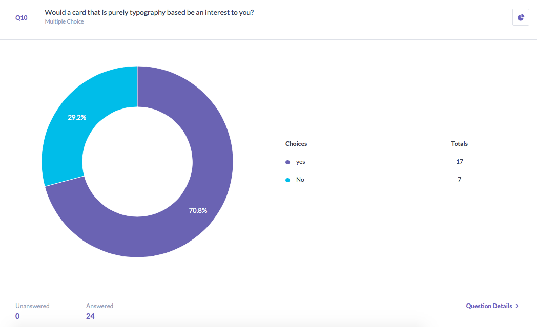


To confirm that our concept would for we decided to create a survey and ask people about why they choose to buy cards and if they think that a gender neutral card is needed. our results found that people liked the idea of a gender neutral card.
No comments:
Post a Comment