From idea generation, we discovered a composition that worked well for each occasion. Following this we then experimented with colour of the collection, as we found colour is an important element which determines the target audience. Because of this we decided not to use gender associated colours as we didn’t want to confirm stereotypes. When receiving feedback from this concept it was discussed that the aesthetic was that of a luxury feel because of this we decided to use metallic colours as ordinary colours would not convey this aesthetic.


After presenting out early design ideas and development in a crit, it was suggested that we open up our designs to more than just happy birthday and to possibly design our own gender neutral typeface. After receiving this feedback we decided that it was a god idea and the it would add a personal touch to the cards design. I then went on out adapt the bodoni typeface by thickening the strokes and shortening the serifs. By doing so i found that the typeface became a nice mixture of both masculine bold strokes and think delicate female strokes which were typically shown of card designs. When receiving feedback on this typeface from eve and other students they agreed that the strokes were a nice balance and that the adaptation really added to the design.
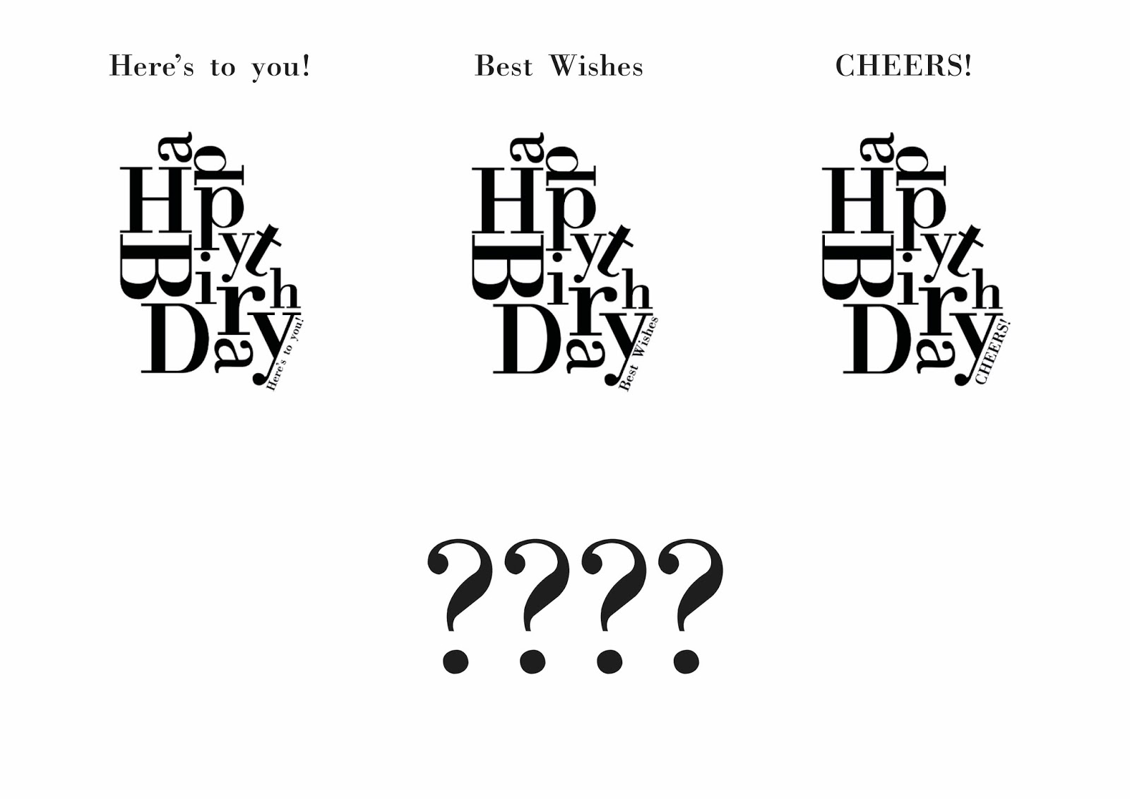
below are the type examples
comparrison on typefaces

bodoni

new adapted typeface


After designing the gender neutral typeface i redeveloped the type composition swapping out the normal bodoni for the gender neutral typeface i had created. By chanigng the typeface the design instantly looked differnet as the design was very bold to start with but the change of typeface still had the bold impact but was more delicate and allowed the letters to connect better in the compostion. With the letters being able to connect better wit the new typeface it made the composition tighter making it look whole and not seperate. Although the design is tight the serif font increases the legibility of the type and allows the type to be readable in any composition.
Bodoni

gender neutral typeface

comparison

No comments:
Post a Comment