YORKSHIRE SCULPTURE PARK
From the day visit to yorkshire sculpture park i took photos of the most iconic pieces of work and also buildings as they are the things the park should be noticed for and would be most useful to influence my logo design.


From these images i did a few quick sketches so i could get the feel of the shapes and only using lines to recreate the complex detail. This will made it easier when recreating them on photoshop and making them into a logo.


These three simple outline drawings represent two permeant sculptures at the park and the main gallery building. These symbols have enough detail so they are recognisable but they are still very basic. Once i had these designs i experimented with colours and how well they would work on different backgrounds so that they would work in all YSP publications.
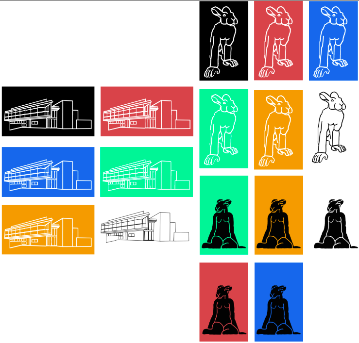
This experiment showed me that the building symbol and the rabbit crawling were the most successful and transferable design. Those two symbols were visible on all the colour tests and the detail was still clear. The sat up rabbit symbol wasn't a successful as the block colour of black was too powerful and took away from the design.
From here i needed to see how well the symbols would work with text this would help me decide on the symbols effectiveness.

this is unsuccessful because that black background takes the attention away from text and makes it irrelevant, and is the most important park of that design is must work along side text, not without it.

This design does that same as the one above, the background is over powering.

Unlike the other symbols above this one works well with a back ground as the symbol is white so there is contrast in the design. there is also a resemblance between this symbol and the current YSP logo design as the symbol is also in a black circle. This adds links between the old branding and the new rebrand to maintain some consistency.

This design is successful as the building is easily recognisable and the main part to the sculpture park. The design is made from just lines so is easily transferable onto different coloured backgrounds, but could be considered too detailed to be a symbol.

This design is also successful in similar ways to the one above but is also successful because of its basic design and also shows one of this permanent sculptures of the park and gives the viewer an idea of that they could expect to see in he park.
After evaluating the successfulness of all my designs i decided that the rabbit in the back circle was to be my final, as the design works on different backgrounds are it is and would not need changing, as well as the fact that there is a link between the new and old symbol.

No comments:
Post a Comment