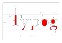
Below are image of my final bound book
Sunday, 30 October 2016
Thursday, 27 October 2016
finalising pages
After crating the previous pages i of naming parts of anatomy and colouring pages i had to create the answers section. Below answer page, these page are the same as the other pages just with the names filled in and the anatomy colouring in the same colour that the colouring page stated that it should be coloured in.
Because the book had to be in signatures of 8 page (4 pieces of paper) the answers were not in the same layout and the colouring images as the pages were pushed forward a page due to the answers page, this left the double page spread having to be split, although it was unable to be a double page spread in the answers this was not an issue as the answers were still clear and in an understandable order.
Anatomy of type title page ( title page before main content)
Above is the design for the title page of the anatomy, applying knowledge, answers and notes sections of my book. I thought it would be an effective design choice to keep the aesthetic look of the colouring image as part of the tile page as it is the main part of the book, it as well as the black line boarders create a consistent look to the book and allow the design to be consistent throughout.
Front cover
Back page
Asimilar intended look was applied to the front and back covers. I decided not to colour the type on the front as i wanted the students to be able to personalise their own front covers with their chosen colour choice.
Blank notes page
For the pages that the students can take notes on i decided to leave the page blank and not have lines on as their notes could be drawings too, i did not want to restrict the page to writing only. I chose to just have the black boarder on so that it staid consistent with the rest of the book.
When considering how to start the book i had to decide what information/introduction i would have, i didn't want the start to be over complicated as it would set the tone for the rest of the book, Because of this i decided to go with a simple copyright line on the left hand page of the book and on the right the introduction that was a very brief summery of what the book is and what they will need when working through this book, i decide this was an appropriate amount of information as i didnt want to over complicate the introduction buy going into too much detail as the book is very self explanatory.
First inside page
introduction page
Thursday, 20 October 2016
further page design
More colouring pages
Above are the rest of the colouring pages images, they are in the same style as the previous designs but i have added type at the left cover instructing the reader on what part of the letter to colour and in what colour. I have chosen the colours as they link with the intended colour theme of yellow, red and blue, but it also allows the reader to check their answer with easy as i intend to make the answers the same colours as i have told them to colour it in. I have also chosen to put all the content in inside a black lined boarder this is because i contained the colouring images inside of a box so that the could be places nicely on the page allowing for space for text, as well as this it will be constant throughout the book and will allow the book to flow from learning to applying knowledge seamlessly.
More applying knowledge pages
Above are two more of the apply your knowledge pages where the anatomy is coloured in and you have to name the parts. Similarly to the colouring images these are also contain in a box to maintain the consistency.
Wednesday, 19 October 2016
prototype
After deciding on a binding method and typer type i thought it was important that i make a prototype of my final to see if the binding and paper worked together and if it was a durable as i had intended it to be. Below are a few images of my prototype:
After making this prototype i had confirmed that the binding method and paper worked together and that the book was durable enough to withstand transporting. The book laid nice and flat on the table and the bright with paper really make the black letters stand out on the page.
From making this i created a list of things that i had to keep in mind when binding my final book :
- make sure i carefully and accurately trim pages
- create small holes for thread as large holes look untidy
- pull thread tight as the book is tightly bound
- make sure corners on front and back cover and nicely folded when covering mount board
-check the pages are in order before binding
- wax the thread so that the thread is more durable and easier to bind with.
After creating this prototype i decided that i would get a student to try out my book design by colouring in a few of the images to see if they agreed with my choices so far :
Feedback :
"The book was really effective at clearly showing the learning information and putting it practically to use was simple and fun. The paper choice was excellent as the fineliners that I was using didn't smudge at all."
Subscribe to:
Posts (Atom)


