to start my designs i decided to experiment with basic and rough mock ups of the layout and how it would appear on the page.
Landscape
portrait
After making these quick mock ups i decided that would make my book landscape. I decided this as it allows there to be more space for text and didn't over cramp the page like the portrait page did.
Following on for the idea that landscape allowed more scape on the page i decided to make another quick mock up of idea to see if would not only benefit the colouring pages but the rest of the book. The mock up showed that it did allow more space for the content and allowed the content to be spread out over a long double page stead, because of this i decided it was the most appropriate use of the space on the page. It also gave the book an edge on all the other books as most text books for students are portrait.
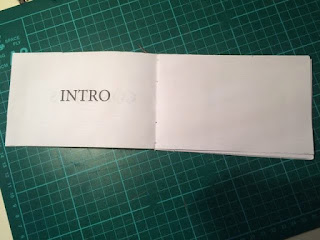
To see how this would work as a book i decided to use the signature method to print a very basic mock up of the pages including the designs above that will be used as the colouring letters were the user will colour the parts of a letter that will be stated on the page.
Above are photos on the mock up of the pages, i bound them with the signature technique as this is a method that have perviously looked at and considered using as it shows the stitches down the spin, i thought this was appropriate for my book as it is a nice link to the book content of the construction of a letter(anatomy). After creating this mock up i decided that i really liked the binding method as it allowed the pages to lay flat and did not hide any information on the page. I also decided to reconsider the way that the information was lid out on the page as the page look bare, and the idea of colouring just one letter at a time didn't seem as advanced as i would of liked. When i asked for feedback on this they also agreed that it would easy and that they would loose interest as they would all be the same with no difference of difficulty or style of colouring, Because of this i now have to reconsider how i am going to present the colouring pages of my book.
After having to rethink of how to present the colour part of my book i decided to look back at how adult colouring books present their colouring images. In the adult books the images are used as patterns, because of this i decided to experiment with creating patterns with letters that the intended audience can search through and pick out where they need to colour in. The top image is to colour in the bowl part of the letter forms and the bottom one is to colour in the stem part of the letter form. After creating these designs for the colouring pages i asked for some feedback :
would you find a rang of these style of images useful and engaging enough to complete after reading about the anatomy?
-yes these are engaging and i like that there is some order to what you have to colour.
-yes its like wheres wally meets colouring, great idea would definitely take time to do.
I also asked if they would find a section at the back of the book about serif, san serif and slab typefaces useful and the feedback comments were :
- yes i think it would be useful but i dont think it would be needed if you go into depth about the anatomy of type.
- no i dont think it would be, i think you should concentrate on making a wide range of colouring pages.
After receiving this positive feedback i decided that i would continue with this idea for the rest of my colouring pages, and to rethink the section of the book on classification to typefaces.


No comments:
Post a Comment