The Geometry of Type
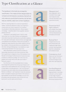
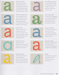
the book The Geometry of Type, was a great source of research as the book went into great detail above the uses of the type, the style of type and also the anatomy of type. After reading this book i considered the use of type in my book and what typeface i was going to present my content in. i Decided that the most appropriate typeface would be a serif font as they are the most legible typefaces to read when it comes to printed type, Also this book made me consider what other information of include such as talking about serif, sans and slab typefaces and their differences and uses.


No comments:
Post a Comment