Below are scanners of useful pages from the book print and finish I that i gained a lot of information from on what was possible to do with a book. Most of my considerations of design were lead from this book.

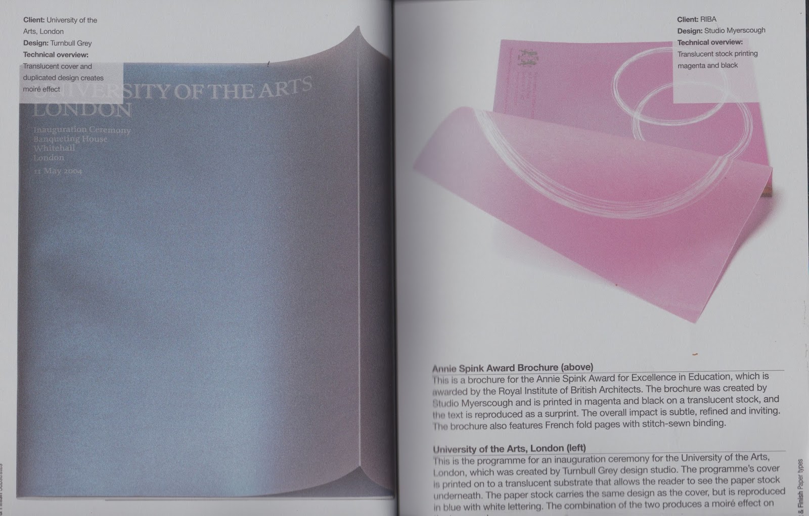
consideration of white image/text on coloured background to create interest - not cost effective and white ink is not available in uni


having a show through insert as part of the protection for the pages - inside pages won't need protecting.
considered plastic to cover and protect- plastic is flimsy and would not protect the pages very well.

Consideration of printing layout, paper and method - made me think about my paper choice and layout for printing.

Consideration of using brown paper to create a sketch book feel, rough - not cost effective, possible problems with printing double sided.
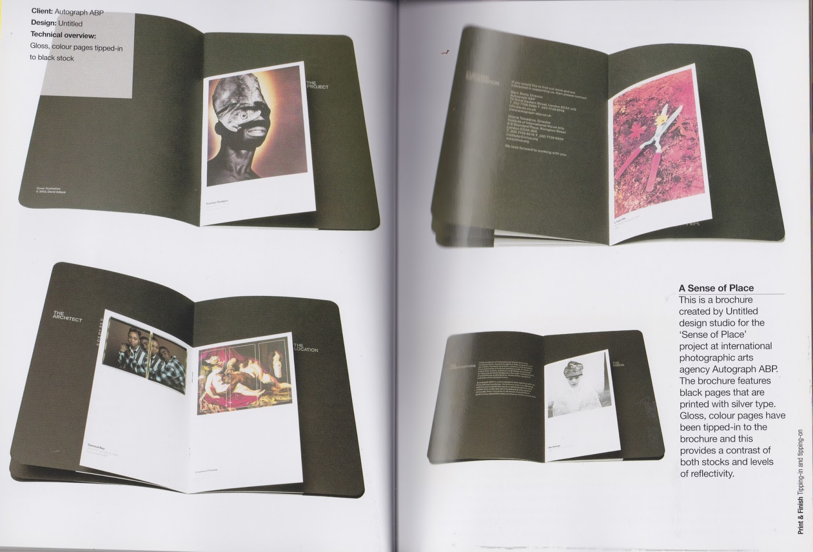
consideration of a pull out, possibly used for content that tells you when the anatomy is, useful so that you can keep it- not cost effective would limit the binding method.

consideration as mass printing method- cost effective for a large print run which is what i intend.

letter press, to add the hand crafted touch- not needed for educational colouring book, and would not be cost effective for mss production.

varnishes, to add depth and highlight certain areas- not needed for educational colouring book, and would not be cost effective for mss production.
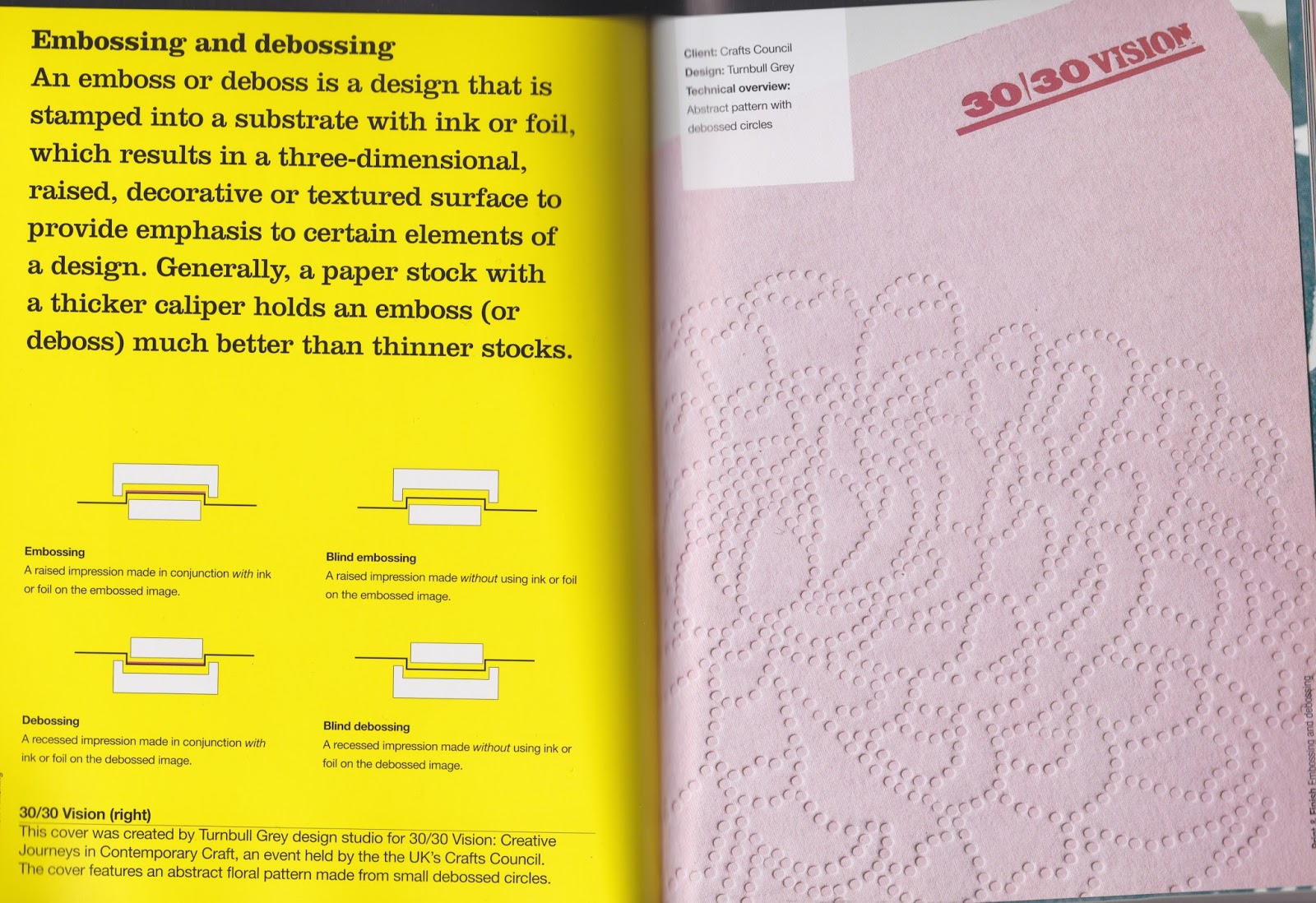
embossing, create interest, hand crafted feel - not needed for educational colouring book, and would not be cost effective for mss production.

consideration of overprinting colours to create an interesting print- over complicated for simple educational book, would also cost more for mass printing.

consideration of wire binding so that the book can lay flat when reading - positive that it lays flat for easy reading

alternate binding methods, open bind, allowing the stitches to be seen, shows the making/structure of the book - would reflect the making and structure of the anatomy on a letter.

alternate methods of binding, considered quarter-bound with a dust jacket - dust jacket would protect the book from damaging, and getting dirty.
the thames and hudson manual of typography by Ruari Mclean


Although this book is very similar to print and finish, i was looking at the same elements, this book showed me a different view point of the same things such as paper choice, book design and methods and compositions. The book also talked about legibility and its importance and how it is a dangerous yet interesting term as it does not have a definite term as it is the designers personal word for their opinion. For something to be legible the designer must know what is to be read,why it is to be read and who it will be read by. These were interesting considerations and valuable to my consideration of type as i want the type to be legible for the audience. The what will be the information lettering them about the anatomy The why will be to learn about the anatomy of type. The who will be students. After deciding on this i could then make an informed decision about the typography and know that it would be legible and suit its intended purpose.
Graphic desing cook book


graphic design cookbook was a great sauce of inspiration for my page layout as it gave a wide range of pre-made layout that you could used and combined with other layouts.
No comments:
Post a Comment