Zine layout research
This layout is simple typographic based, it allows for the text too flow and key phrases or words to take centre stage on the far right page. I believe this layout is very effective however I don’t think it will be useful for my idea of a contemporary design look book.
Laurore - This second layout allows for a image or two, to be placed in multiple different places situated near each other, allowing for the viewer to be shown multiple angles or key sections of the image. The text on the right page is also legible and does not take away from the images.
The third layout uses a simple and clear layout with plenty of space for imagery at the centre of the layout. However the layout only allows for the input of one medium sized image limiting the amount that can be done with this layout.
overall one From this research I have learned that for the cookbook that I wish too create there needs to be plenty of space for the image to clearly be position and allowing for typography to support the image in conjunction.
zine research
Chicago Zine Created by Sofia Clause following a trip to Chicago, Sofia selected 10 buildings and produced a spread for each, exploring distorted typography and imagery inspired by the warped reflections of the buildings and surrounding environment on the surface of the Cloud gate sculpture. The use of warped typography is very effective when in reference to the subject matter of the zine, and the minimal use of colour adds a interesting ascetic to the overall zine.
Modernist zine Showcasing a passion for 20th century architecture and design that they shared with an ever growing band of writers, photographers and designers they had made friends with through the society’s projects, events and campaigns. This zine is a perfect example of a modernist movement today, with a emphasis on expanding modernism where ever it can be found. The grid layout in this zine is a excellent way of conveying this information as it can be clearly let and the use of a single colour on the pages adds to the modernist ascetic of the zine.
The past Recedes zine This zine is a two part zine by Markos Zouridakis on the subject of telling a story, specifically the differing interpretations of memories. The content consists of archived family photographs, hand-drawn diagrams, calligraphic elements and collage. Thd overall aesthetic of the book is a beautifully messed view on how different memories can be interpirtated. The zine itself is beautifully crafted with two small zines combined and stitched together using a saddle stitch to combine the zines.
Miscellany The publication is a annual review created by Ryan Len that takes a look at what issues caused him to create a collaborative creative community in Singapore. The publication features super slick icons as well as featuring a fantastic choice of typography through the publication. On the front cover of the publication is an amazing contrast of colour with a pink piece of paper placed on bound to the book. This simple yet effect item creates a truly eye catching front cover to the publication.
Portotyping my zine
Early prototype
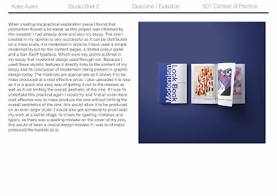
Above are images of an early prototype i created to see it the order of the content would follow and also to get an idea of how strong the saddle stitch would be to hold a 10 sheet (40 page) zine together. From making this prototype i found that the stitch was strong enough for the zine and held the pages in place perfectly. The content did follow as well as i expected. When looking over the zine i found that a select few of the images were pixarlaed and this was something that i had to go back and check or possible swap out for different images.
Up dated prototype
Above are images of more developed prototype of the zine, i had swapped out the pixelated images and for some pages had to change that artist as the high-quality images were limited. From this prototype i found that there were spelling mistakes on the front and inside covers, because of this i will have to go back and correct them before printing my final zine.
Othe rthan the spelling mistake this prototype was successful as ll the images were high quality and the two layer front cover worked well as it created interest and gave the front a professional look.
design developments


No comments:
Post a Comment