Monday, 26 February 2018

Brief 2 - YCN frontier - Wire frame

The most critical stage to the App was developing the wire-frame, by creating versions of the wire-frame it allowed us to judge how well the App would work and if our intended design worked successfully. A key part of the application was usability, we wanted to make an app that was as usable as possible. We wanted to created an App that was as simple as it possibly could be but built upon the pre-existing features found on the Frontier website creating an inclusive app that includes more audiences than just the target audience.


The social aspect of the pub quiz is very important as it is a big part of pub culture and our aim is to encourage people to try frontier, while drawing them to frontier locations using the pub quiz. By having the pub quiz as an integrated part of the mobile App it allows the target audience to take part while promoting the new format.

It was important to built upon the pre existing branding material for frontier, this created a simple and clear link to the website, a example of this is the home screen. We created a set of pages with clear headings and we decided to make images that were all linked together through the same simple colour of white to contrast the colourful background allowing the user to clearly see information that the pages provide. Another design feature of the app was the conscious choice of colours that created a simple yet effective flow to the app. 

Brief 2 - YCN frontier - Colour scheme, Type and Imagery


These are the colours we swatched off the Frontier website, these are the closest colours we could find that Frontier uses in its branding without having the correct pantone codes. We decided these colours were the most appropriate to use as they are the colour of the already existing branding which we didn’t want to change as it is already a very noticeable trait of the brand, and wanted our idea to continue with that but expand upon it to make the success of our idea greater. This also help to tie the our App idea with the style and design of the website. 

Further tying into the existing Frontier material we decided to bring the sail ship from the Frontier logo to life and use it in the App’s loading screen to make the opening scene more visually pleasing. 
As a consistent theme through out the App we chose to use the maps that feature in the Frontier logo this created a natural flow to the App design which linked seamlessly with the logo. 


Similar to the use of colours from the Frontier website we decided to use the typefaces which we thought were as close to the original as possible continuing with the seamless link between the App and website.

Saturday, 24 February 2018

Brief 3 - Plant Publication - Development


Taking my inspiration from the magazine spreads I looked at I began developing ideas for page layouts initially just experimenting with imagery. These developments helped me decide which direction I wanted to go with the design element of the content within my publication as this is just as important as the content. I experimented creating a range of different pages such as title pages, double page spreads and layouts for the ‘pritty plants’ seaction of the magazine. The most successful sppreads from this development were the spreads that used square or rectangle shaped imagery as the iregular shapes were to distracting and limited the image size which was important to this magazine as the astetics are very relevent to the subject matter. What worked the best was using a grid making sure the images were a uniformed size for each shape, this is something that I will use going forward as making sure there is consistanty through out the magazine spread designs. When using this grid I will also be placing the text of the articles themselves into a column that will fit within the grid. 


Design profile : 

typeface : 
Helvetica Neue Condensed black - headings
Helvetica Neue Light - copy
black type for all text, with the exception of when numbers/type overlaps imagery that would not show black text, then white will be used.

Pages:
most pages set as double page spreads for maximum effect

grid:
2 columns used for copy
1 column for title pages 


When creating these developments I decided that it was important that I had a powerful contents page and title page to divide each part of the content as it would set the tone of the information that the audience is about to read. A key part to making the title pages and contents page successful was the use of powerful and colourful images that caught the audiences attention while using a grid and the use of only two typefaces through out. I chose Helvetica Neue condensed black for the titles and Helvetica Neue Light for bulk text. I used these typefaces as they are both very sleek and minimal, similar to my intended content aesthetic, as well as having contrast between the two so that headings and bulk text were easily defined. For consistency each title page started with the same layout of half a page image and the other half a large title and introductory paragraph, this consistency set the tone of the magazine being simple, clear and structured. Although there was consistency in the title pages I still created a range of different spreads that complimented each other and the consistent title pages by using column text, large images and the same typefaces. One of the most interesting spreads to create was the horoscope spreads as a lot of information needed to be confined in a small space with out looking overcrowded. A way of creating more space was to use circle shaped imagery along side the text for each horoscope as it opened up the space around it that would of been taken up by a square image, this created an open spacious layout that would of been cramped other wise. 


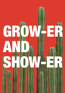
After designing the content of the magazine I moved on to designing the cover. I decided to design the cover after the content as I could then create a true representation of what’s inside. In a crit I asked for suggestions on what to call the magazine as I was struggling to decide on a name. Suggestions were names that were a pun such as solid, pushing daisies, don’t die cacti, staying alive, bud or dud planted, and grower and shower. After some further discussion I decided on grower and shower, it was then pointed out to me that show-er read as shower so I decided to add the hyphen to both grow-er and show-er so that it would be read correctly and also be symmetrical. I chose this name as it is a pun that is fairly suggestive and would be humorous to my intended audience, but also because the aim is go grow the plants so you want to show them. From this I developed a bright colour cover that reflected the inside, while also using a tall plant the is suggestive towards the title. When developing the cover I experimented with the placement of the type, going in front and behind the tall cactus. In the end I decided to use the cover that had a large title that filled the width of the page, and grow-er was behind the plant for reference growing and the hight of the plants, and show-er was in front of the plant so that it was ‘showing’ and obvious, because of its references to the title in its composition this is why it was the most success. When designing the spine of the cover it was mentioned in a tutorial that i could design it as part of a collection to reference the collection growing similarly to the plants. I liked the idea of this so I decided that I would continue the cactus on the spine and the more issues that would theoretically come out later the cactus would grow along the spine with it. This worked well as another reference to the content and the idea of growing. 


Friday, 23 February 2018

Brief 5 - Clothing Brand - Production and Final Outcomes


After deciding on a final logo design, I began applying the logo to various different products, these products were determined from my survey giving me accurate information on what my target audience would want to purchase. These products included a t-shirt, hoodie, jumper, leggings, phone case and hat. When applying my logo design to the products I kept in mind that they were for a gender-neutral audience and kept the colour palette limited to muted colours such as black, grey and white. When it came to making my products I used psd mock ups as I did not have the time to produce physical products and I did not have the budget to pay for them making as this would not have benefited the project. When placing the design on the mockups I had to keep in mind the sizing and placement, If the logo was too big then some people would be off-put from buying the product and if the logo was too small it would not be beneficial to the brand. From this I decided that a small logo on the front of the t-shirt/hoodie/jumper would be appropriate to this type of brand as similar style brands often do this and have had great success with it. For the back of the t-shirt/hoodie/jumper, I decided to use a large logo as the back of the garment is usually where brands place a large logo so that other people can recognise the brand from far away. This would be overpowering and off putting on the front of the garment as the brand is not a big well-known brand. On the t-shirts/hoodies/jumpers I used a grey logo as it worked well on both black and white, this allowed me to be consistent throughout my designs. On the phone case and leggings I decided to apply a repete pattern of the logo. This worked well as the placement of a single logo on both these products was challenging as it was not as effective as the other products. 


When discussing my clothing brand with peers I was asked if I was going to create additional materials to promote the brand. At the time I had not considered this but when in a discussion it was mentioned that bags for the clothes, tags and possibly a promotional magazine would benefit the stressfulness of the brand identity. After this feedback I went on to design the suggested items, as I too believe that I would strengthen the bran and the project. 

Similar to the products i decided that a simple tag design would complement the products, a white tag would be used on black items and a black tag would be used on white items. This creates a contrast in colour while still maintaining the muted colour pallet that i had decided on. The bags for the colours were designed in a similar manner with the added brown paper bag to add more texture and reflect the aesthetic of an independent brand. 
The publication i create for the brand was a simple saddle stitch bound booklet that showed off the products i had designed. I chose the saddle stitch binding method as it represented the indie nature of the brand with it being handmade. 


(please find a physical booklet in my submittion folder)


The final designs that I created incorporated the logo as a key part of there design, I chose to do so because when reviewing my research on indie brands, I noticed that throughout many of them their main design focus was just simply their logo adapted to many different sizes and colours. I believe indie brands chose to design there products in such a fashion so that their logo is on show allowing them to generate advertisement from every purchase because it is very visible and eye-catching which makes other people notice it. I believe I have successfully achieved what I have set out to do as I have created a professional and realistic brand identity by creating an eye-catching logo. I have also created a brand that is directly related to what its intended audience wanted\would purchase as casual wear products. I intended to create a brand that did not incorporate casual wear however after reviewing my survey results I found that the brand would be more successful and well received by its audience if it did incorporate this aspect. A successful aspect of the product design is the muted colour pallet, this allowed me to create gender neutral clothing items that are not readily available in most clothing lines. If I was to continue the designing of these products I would create a more colourful range of products as well as create a range that incorporates imagery. This would only benefit the brand when it is more well known and has a better idea of the audience that is purchasing the products. 


Wednesday, 21 February 2018

Brief 5 - Clothing Brand - Logo Development


After researching and deciding on the name Ninety- ninety i moved on to designing a selection of logos. As the name suggests I took influences from the idea of 90o angle and the shape of a mountain which related to the brands audience of snowboarders. 

1. Like the angle of the text. angles dont look like angles as they are too dark,
2. better than 1 but type looks out of place
3. dont like the opposite angle of text and angles drawing is too small. 
4. like the use of type representing the angle, would be legible at any size
5. again like the angle, smaller angles too distracting and over complicated
6. simpler but too much black 
7. like the use of arch making the representational angles stand out more, 
8. like the detail of the mountain but too distracting from type. type need to be clear
9. like linear type, could work well down a sleeve mountain shapes too harsh
10. mountain shapes still too distracting from type
11. too cramped, type is not legible
12. type is more legible but still not clear. 
13. clear type, would work well on any scale.

When it came to choosing a logo design that i thought would best represent the brand I decided to ask for feedback as in my opinion there was a few design that I thought would work best. The feedback i received from fellow students was that design number 7, 10 and 13 were the most successful overall as they were simplistic in style which would easily allow them to work on a range of products in a range of colours across a range of different sizes. After receiving this feedback I decided to use logo number 7 as it was the most representable for the 3 most successful designs and was a good compromise between purely typographic and a detailed logo. The limited detail in the logo allows the design to be resized with ease and does not limit its effectiveness as a design.


Tuesday, 20 February 2018

Brief 5 - Clothing Brand - Survey's

A key part of my research was a survey, the questions I asked included:
do you partake in any of the following sports?
do you think street wear is effecting sport wear brands intended purpose?
Do you feel that people wearing sport apparel as street wear has effected the pricing of sports apparel?
Do you wear sports wear from brands such as vans, nike, addidas, DC, etc ?
what products do you buy from the before mentioned brands?
do you buy sports apparel from indie sports brands such as palace, supreme, hype, element etc?
why do you purchase things from these brands?
do you find the logo design to be important when viewing indie sports brands?
I chose to not include gender in my survey are the brand that I intended to create is unisex similar to the popular brand vans. 

Below are the questions that gave me the most guidance on what sort of brand I should create and what sort of products to apply it to. From this survey it determined that there was a place in the market for indie sports brands as well as what type of products people buy from indie sports brands such as palace and supreme.  Over 60% of the people who took the survey said that the logo design influences their purchase of the item this made it important to have an eye-catching logo design that could be easily transferred to multiple products and work in any colour. 25% of people said that they purchased the product purely for the brand name, these are the people who I don’t intend to market my brand at as it is intended to be an indie brand and not a mainstream commercial brand. 20% of people said that they chose to buy the items because of fashion and for casual wear, out of all the people who took the survey these were my target audience, as with these people in mind I could make a successful brand that would be received by its intended audience. From this research I also found the type of product that the audience would be interested in, these were: hats, jumpers/hoodies, t-shirts, leggings, and phone cases. 


When it came to choosing a name for my brand the question from my survey that asked ‘do you partake in any of the following sports?’ had the most influence. The sport that most people who took the survey partook in was snowboarding, because of this I decided that the brand name would represent something to do with snowboarding as this seemed to be the biggest audience for my indie sports apparel brand. When researching into snow boarding and snowboarding moves i came across a move called the Ninety-Ninety, this move had a nice sound to it compared to other snowboarding moves, and from the name itself already sounded like a brand.