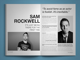
2 colums, mixture of image sizes, and typefaces, black and white
large image, mix of typefaces, type centred on page
mix of 2 and 3 colums used for type, seletion of different shapes images, colour squares picked out from images.
no columns used, all images shaped as a hexagon, lines and dots leading off to small amount of text relating to image.
3 column grid, only 2 used for type, large image, block colour added to compliment imagery.
Before starting the designing for my content it was important to look at magazine spread for inspiration so that i was clear on the overall aesthetic i wanted to achieve from my design. I began looking at magazine spreads that had a equal balance between type and image as often some spreads favour one over the other. I found that the use of grids helped to control the balance and was easily manipulated to addapt to the content. The more successful spreads used a mixture of full-page images and smaller well placed images scattered throughout the text. The less successful spreads used too many typefaces and type sizes combined with irregular shaped images, this was distracting from the article itself and the meaning was lost. However I found spreads that used the same irregular shape image repeadidly throughout the publication were more successful than others that use a small amount of iregular shaped images as it created more of a consistanty then a distraction. From looking at these spreads I took a intrest in hexigon shaped imagery as well as tiled imagery as these compositions displayed the imagery in such a way that it created intrest with out distracting you from the article itself, because of this I have decided to experiment with these styles for my magazine spreads.


No comments:
Post a Comment