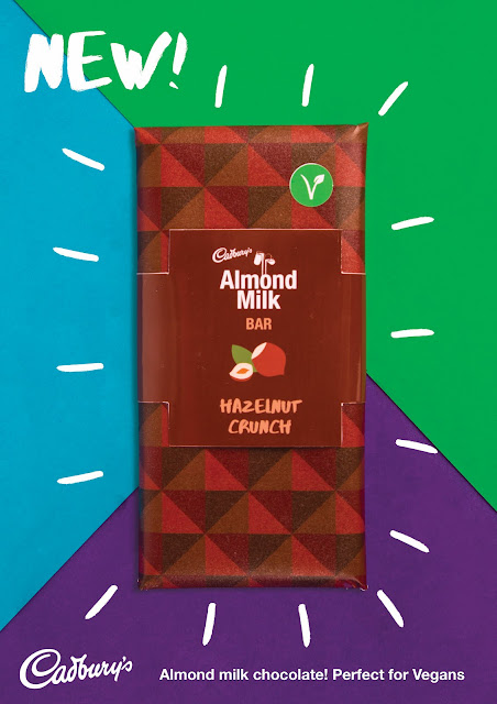
Poster designs :
I created three poster designs advertising each individual bar. As the bars were part of a range, I made sure that the posters we very similar in style so that they worked together and as individuals. I did this by using the same background and type position on each poster to create a consistent design. I used a large image of the bar so that the bar was the main focus of the poster as it is the most important feature to the design but also so the bar is recognisable when looking for it in stores. We decided to create posters as most new products use posters on the sides of public transport, poster boards and bus stops too advertise to a large amount of people. Physical promotions are just as important as digital promotions as they are seen by just as many people and can be placed in different locations. When asking for feedback on these poster designs they liked the lines that went around the bars as this made the bar pop of the page and represented movement and said it reflected the new product ‘popping’ onto the market.
Anna's instagram story
Anna's instagram story
From the photo shoot Anna created a short instagram story that would be used to promote the chocolate range. In the instagram story she used the same typeface that was used on the chocolate bar packaging to keep the design consistent. these match the aesthetic i had set from the posters.
as instagram storys are animated, we decied that it would look good as a short video so that we could get the intended effect. anna ask me to animate the video as she had tried and didnt have any sucess. above is the final video i created.
instagram images:
insta squares
To backup Anna’s Instagram story I created square images that would be posted on Instagram similar to the Instagram story but as a post with multiple images, so that there is a more timeless presence that could also be used on other social media sites such as Facebook and Twitter which also allows for multiple photo uploaded posts. For the design of this I chose to use the same background for consistency but instead of the single images of the bar I used single images of the flavours with there icon and typography to emphasise the creative flavours more to excite vegans about there new flavours of chocolate. I then ended with an image of all the chocolate bars so once again it was easy to recognise them in stores. When asking for feedback on these designs people really liked that it was consistent to the other designs but also its slight variation to create more interest.


No comments:
Post a Comment