Taking my inspiration from the magazine spreads I looked at I began developing ideas for page layouts initially just experimenting with imagery. These developments helped me decide which direction I wanted to go with the design element of the content within my publication as this is just as important as the content. I experimented creating a range of different pages such as title pages, double page spreads and layouts for the ‘pritty plants’ seaction of the magazine. The most successful sppreads from this development were the spreads that used square or rectangle shaped imagery as the iregular shapes were to distracting and limited the image size which was important to this magazine as the astetics are very relevent to the subject matter. What worked the best was using a grid making sure the images were a uniformed size for each shape, this is something that I will use going forward as making sure there is consistanty through out the magazine spread designs. When using this grid I will also be placing the text of the articles themselves into a column that will fit within the grid.
Design profile :
typeface :
Helvetica Neue Condensed black - headings
Helvetica Neue Light - copy
black type for all text, with the exception of when numbers/type overlaps imagery that would not show black text, then white will be used.
Pages:
most pages set as double page spreads for maximum effect
grid:
2 columns used for copy
1 column for title pages
When creating these developments I decided that it was important that I had a powerful contents page and title page to divide each part of the content as it would set the tone of the information that the audience is about to read. A key part to making the title pages and contents page successful was the use of powerful and colourful images that caught the audiences attention while using a grid and the use of only two typefaces through out. I chose Helvetica Neue condensed black for the titles and Helvetica Neue Light for bulk text. I used these typefaces as they are both very sleek and minimal, similar to my intended content aesthetic, as well as having contrast between the two so that headings and bulk text were easily defined. For consistency each title page started with the same layout of half a page image and the other half a large title and introductory paragraph, this consistency set the tone of the magazine being simple, clear and structured. Although there was consistency in the title pages I still created a range of different spreads that complimented each other and the consistent title pages by using column text, large images and the same typefaces. One of the most interesting spreads to create was the horoscope spreads as a lot of information needed to be confined in a small space with out looking overcrowded. A way of creating more space was to use circle shaped imagery along side the text for each horoscope as it opened up the space around it that would of been taken up by a square image, this created an open spacious layout that would of been cramped other wise.
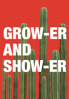
After designing the content of the magazine I moved on to designing the cover. I decided to design the cover after the content as I could then create a true representation of what’s inside. In a crit I asked for suggestions on what to call the magazine as I was struggling to decide on a name. Suggestions were names that were a pun such as solid, pushing daisies, don’t die cacti, staying alive, bud or dud planted, and grower and shower. After some further discussion I decided on grower and shower, it was then pointed out to me that show-er read as shower so I decided to add the hyphen to both grow-er and show-er so that it would be read correctly and also be symmetrical. I chose this name as it is a pun that is fairly suggestive and would be humorous to my intended audience, but also because the aim is go grow the plants so you want to show them. From this I developed a bright colour cover that reflected the inside, while also using a tall plant the is suggestive towards the title. When developing the cover I experimented with the placement of the type, going in front and behind the tall cactus. In the end I decided to use the cover that had a large title that filled the width of the page, and grow-er was behind the plant for reference growing and the hight of the plants, and show-er was in front of the plant so that it was ‘showing’ and obvious, because of its references to the title in its composition this is why it was the most success. When designing the spine of the cover it was mentioned in a tutorial that i could design it as part of a collection to reference the collection growing similarly to the plants. I liked the idea of this so I decided that I would continue the cactus on the spine and the more issues that would theoretically come out later the cactus would grow along the spine with it. This worked well as another reference to the content and the idea of growing.


No comments:
Post a Comment